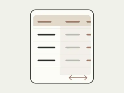
Showing tabular data on a phone
A table does not fit on a phone, while cards make comparison harder. Let’s examine a payment list and decide what to keep visible so people do not have to memorise numbers.
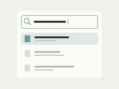
Helping someone find a document through search
Search found ten files called “Completion certificate”, but the right one still needs identifying. Let’s follow one example through the query, results and an empty state.
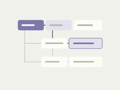
What to do when a sidebar becomes too deeply nested
Company, project, folder, document: the tree keeps growing, and the current project is easy to lose. Let’s see when a separate switcher helps and what simplification must preserve.
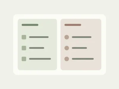
Dividing a large menu into meaningful groups
Finding a completion certificate should not require knowing how the software company is organised. A workspace example shows how to group sections around a client’s tasks.
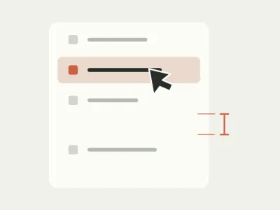
Making a sidebar easier to use with spacing
Every item fits, but selecting one is awkward. Let’s see how spacing distinguishes sections and why a menu needs testing with long labels and a keyboard.
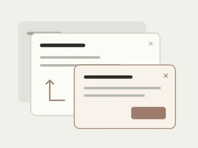
Untangling a dialog on top of another dialog
To add an address, someone opens one dialog, then another, and worries about closing the wrong one. Let’s return them to the request with their data intact and a clear result.
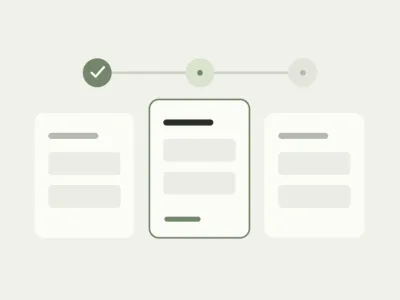
Helping someone complete a large form
A hundred questions can be split into steps, but some answers still need tracking down. Let’s examine an application completed in breaks, with documents from colleagues and a return the next day.
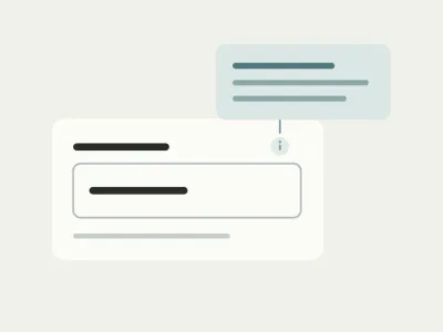
Writing help text that actually helps someone fill in a field
“Enter the contract number” repeats the question without helping find the answer. Let’s look at what belongs beside a field and what should happen to the hint when an error appears.
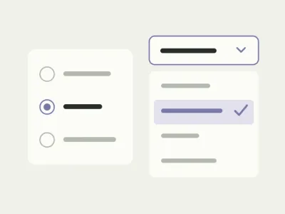
Select menu, radio buttons or search: choosing a form control
Choosing a courier and finding a town among hundreds of names are different tasks. Let’s choose a control around what someone needs to do, rather than the number of options.
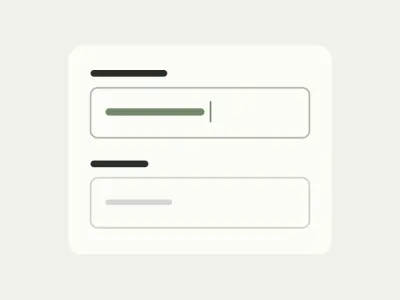
Where to put a form field’s label
An empty form looks tidy but can become confusing once filled in. A delivery example shows how to keep the question, answer and error connected.
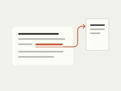
What to put in links instead of “here” and “read more”
Three identical “here” links make you reread an email. Let’s name links to course materials so the right document is easy to spot.
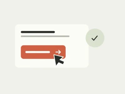
How to label a button so people know what happens next
“Done” can mean saving a draft or submitting a request. A consultation booking example shows how to help someone press a button without second-guessing it.