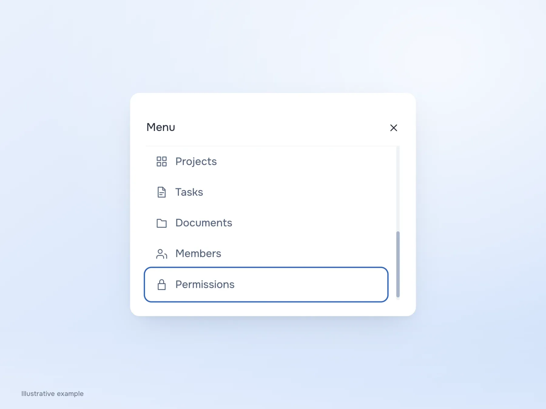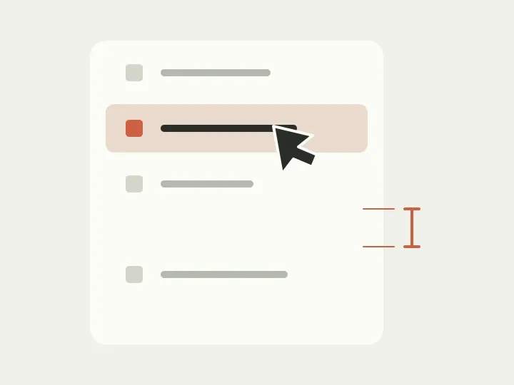
Everything fits in the sidebar: projects, tasks, documents, members and access settings. There is no scrolling, the rows align and the design looks neat. Open it on a phone, try choosing documents, and hit the neighbouring item instead. The names fit, but there is not enough room for a confident tap.
It is tempting to increase all the spacing immediately, but that simply makes the menu longer. Let’s examine a sample team workspace more closely: where does someone need more room to select an item, and where should space mark a boundary between topics?
Two kinds of spacing with different jobs
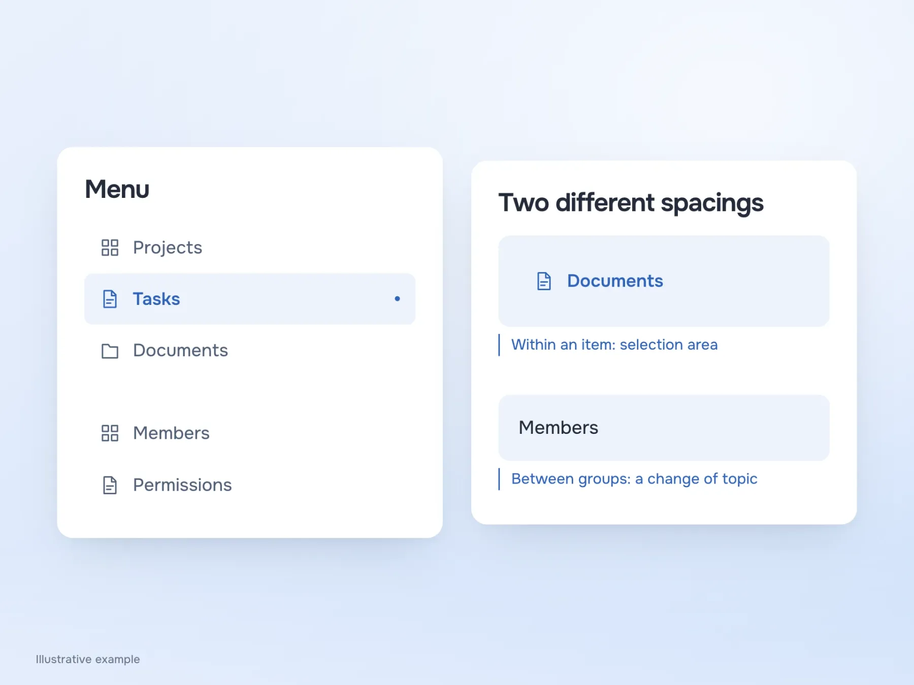
Inside a row, padding separates text from the edges and helps create a comfortable target. Between groups, space marks the beginning of another part of the menu. Change both equally, and you can get a long list where every item still looks equally related.
In our workspace, projects, tasks and documents belong to everyday work. Members and access permissions are for managing the team. Keep the same padding inside each row, but add a more noticeable gap before team settings. The eye now sees a small pause between topics, while each item remains part of its set. If that pause is not enough, name the groups; this is explored further in the article on grouping menus.
The label that did not fit the tidy example
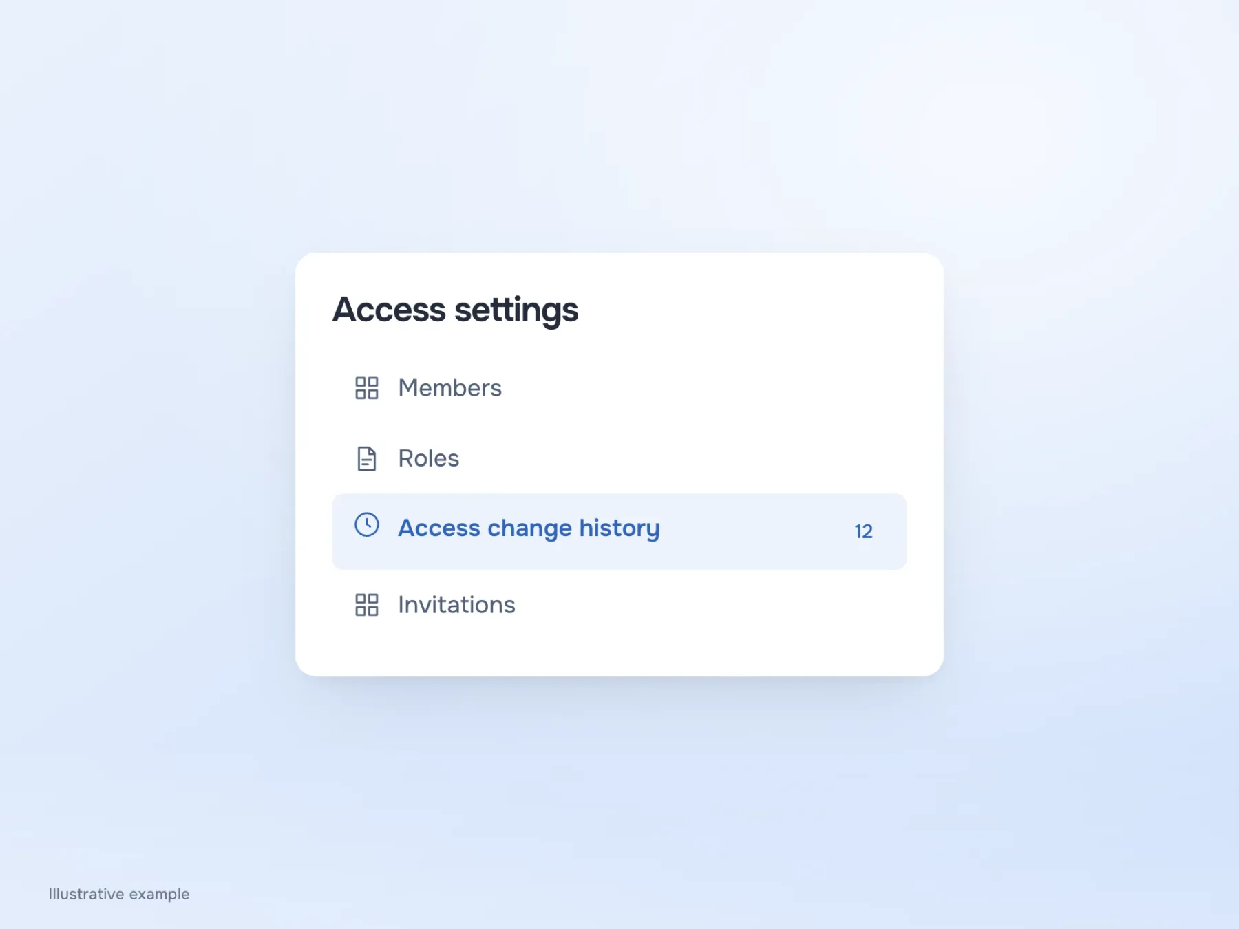
Short labels such as “Tasks” and “Archive” make width problems hard to notice. Try “Access change history”, then add an icon and a counter. The label may now need two lines, and a small fixed height gets in the way: the text crowds its neighbours or escapes its own item’s area.
Include a long label in the design early. If it wraps, the row must grow with it. If it is truncated, people need a way to read the full text on a phone too, without mouse hover. Sometimes a label can be shortened, but several identical “Manage…” labels will not solve the problem. The menu would become tidier by removing the information people use to choose a section.
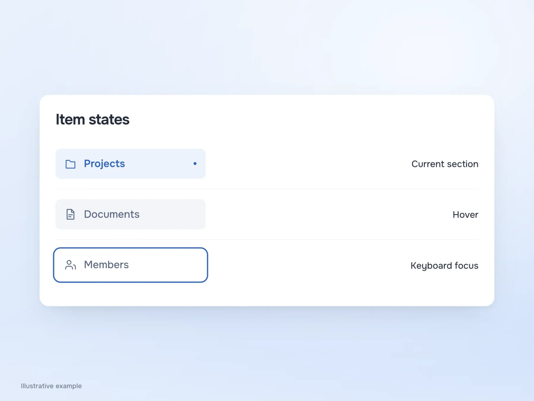
The open section and hover are not the same
Suppose projects is open while the pointer remains over documents. If both items have the same fill, the menu seems to show two current sections. The person has to confirm their location in the page heading, though navigation could have told them immediately.
Separate the states: give the current section a persistent highlight, let hover gently indicate a possible destination, and make keyboard focus an obvious outline. These states can appear together without cancelling each other’s meaning. In implementation, mark the current page for assistive technology too. Location in the menu then remains available to people who cannot see the coloured fill.
Reach the last item
After the changes, it is tempting to judge the menu from a fresh screenshot, but some work remains. Reduce the window height, enlarge the text and Tab through the items. This reveals whether access settings at the bottom can be reached and whether a fixed block covers them. On a phone, try neighbouring items separately: accurate mouse clicks say little about choosing with a finger.
If the error repeats, you can now name it precisely: the row is cramped, a long label is cut off, the last section is unreachable, or hover competes with the current state. Each problem has its own fix. Good spacing need not match a pleasing number from someone else’s library; it needs to help people read and select the items in this particular menu.