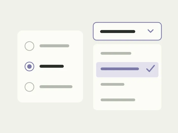
All that is left before placing the order is choosing delivery. You open a menu, see “Collection” and “Courier”, and choose the latter. Only then do you learn the price. You return to collection to check its terms, then back to courier. There are just two options, yet comparing them means changing your answer several times.
The menu may have appeared for understandable reasons: it is compact, already in the component library and matches the rest of the form. But right now the person needs to see the terms side by side. Let’s take a sample checkout and move through delivery, a setting for the number of records, and choosing a town. These actions follow different logic, although we could call each one a “choice”.
When both options need to be visible
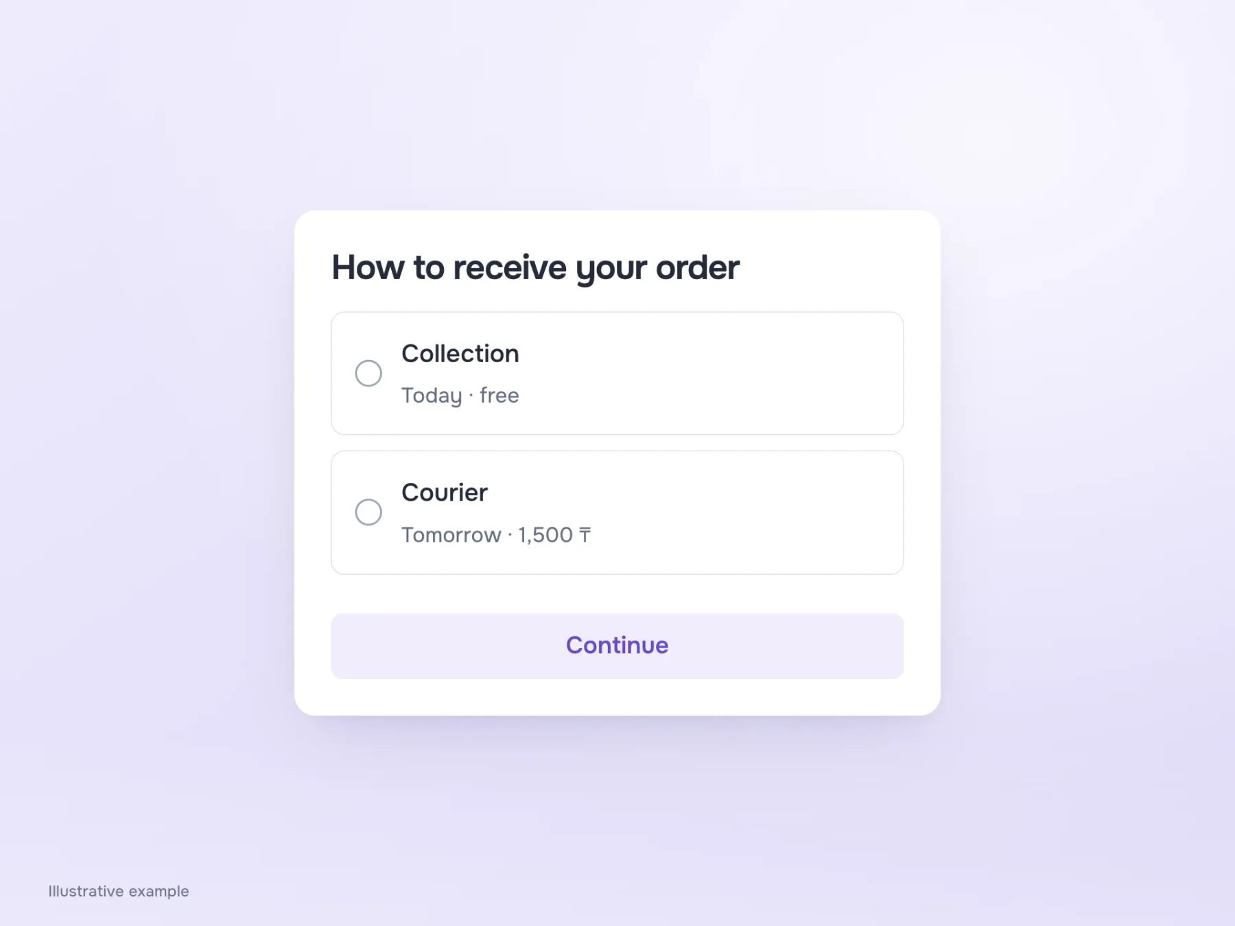
For collection, show “Today, free”; for courier, “Tomorrow, ₸1,500”. Stack the options with radio buttons, and the person can compare the terms before choosing. They no longer have to remember what the closed menu said.
Radio buttons work when only one answer is allowed. If several services can be selected, use checkboxes. Nor do you need to preselect the first option just to make the design look complete: a ready-made answer to a new question is easy to overlook. A setting in an existing service is different, because showing its current value is useful. Start by asking whether we are choosing a new answer or changing an existing one.
Where a compact menu belongs
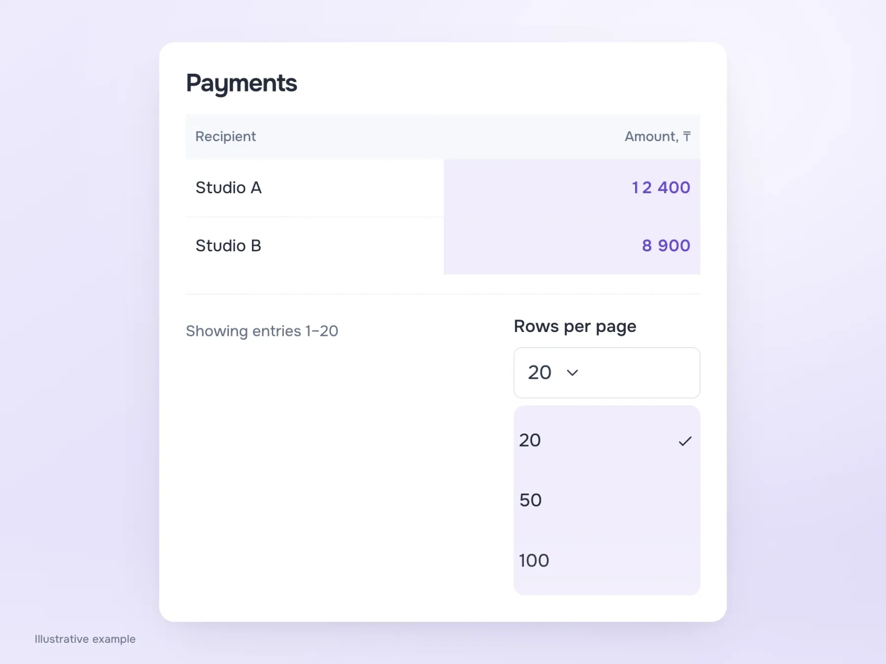
Now imagine a payments workspace. Below the table is “Rows per page”: 20, 50 or 100. The values are short, familiar and need no explanation about price or timing. The person already knows what they want, so opening a menu and choosing 50 is convenient. Three large cards below the table would be odd: a secondary setting would draw too much attention.
You still need to check this control with a keyboard and on a phone. Drawing an arrow does not make a menu easy to use. If the browser’s native control solves the problem, it has an advantage: many familiar interactions are already provided. A custom component is possible too, but you will need to implement and test its behaviour.
When the name is already known
Back at checkout, try choosing a town. Scrolling through hundreds of places is frustrating precisely because the answer is already in your head. The person does not need to explore the directory; they want to find their own entry. Typing the beginning of a name helps more than a long open menu.
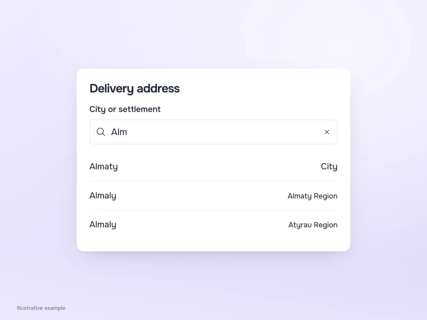
Search brings questions of its own, though. “Alm” might return Almaty and several places named Almaly. The region will be needed beside each name to identify the right one. If nothing is found, keep the entered text so it can be corrected. And if the service accepts only entries from its directory, explain that restriction: do not silently treat a freely typed name as a selected address.
See how a choice can be corrected
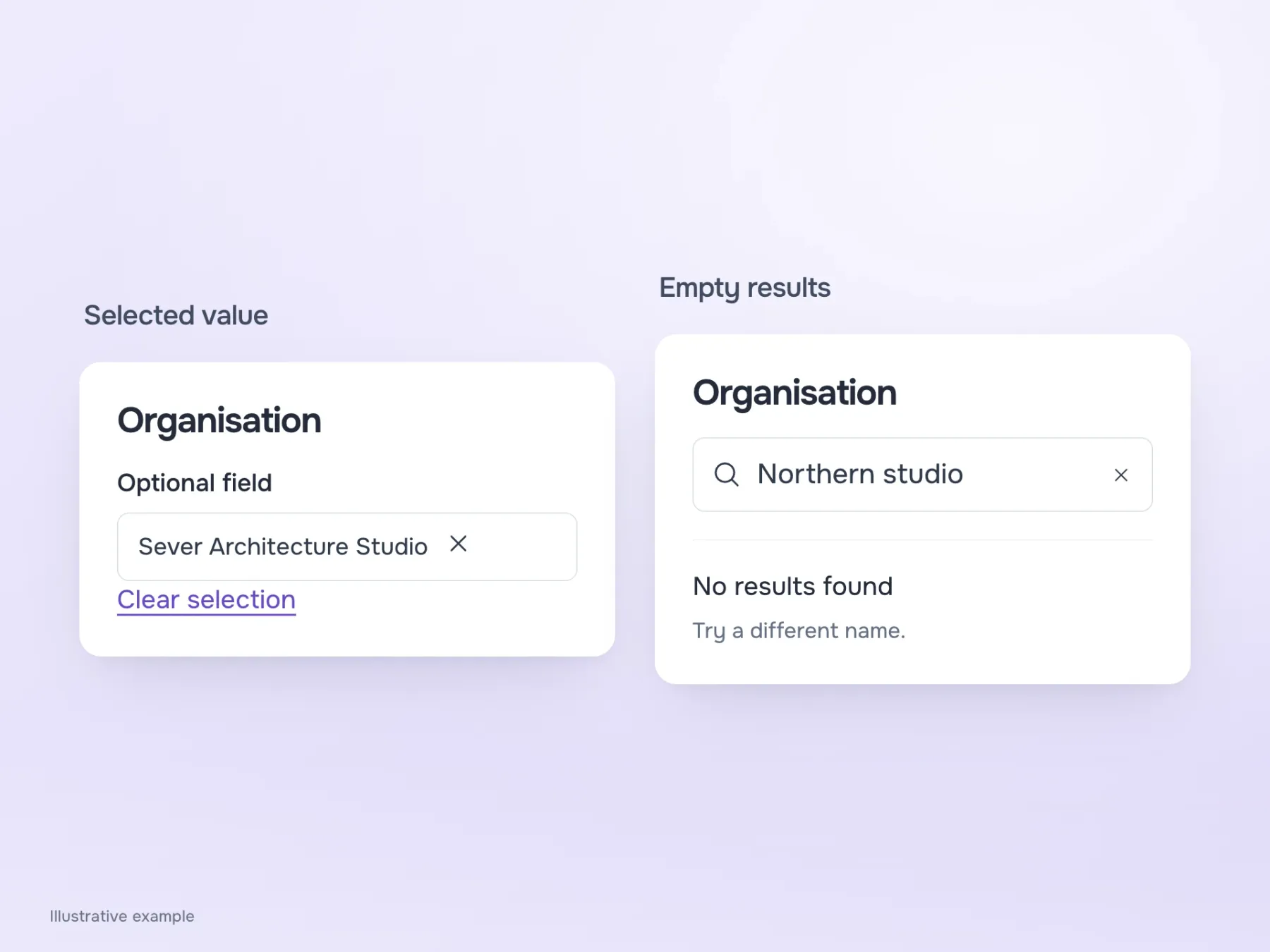
Any control works with ideal examples: short names fit, the right answer is found and the first choice is correct. Start the next check with less convenient data. Try a long organisation name, two similar entries and a search with no results. Then select a value and try clearing it if the field is optional.
This is where you see whether the control helps finish the task. Radio buttons reveal terms for comparison; a short menu saves space for a familiar setting; search shortens the route to a known name. Once you understand what the person is doing, a solution usually comes faster than debating how many options should trigger a component change.