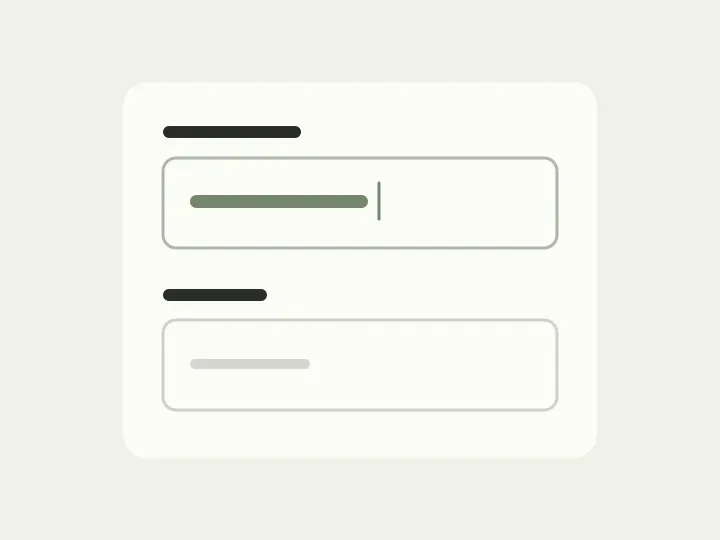
The design has two empty fields, “Request number” and “Contract number”. Their names sit inside them: compact and uncluttered. Now enter 1042 and 5817. The names disappear, leaving two numbers behind. If you get distracted and come back, you have to remember which is which.
That is the catch with the empty state: it shows the form while its labels are still visible and there are no errors. The person will spend time filling it in, then correct something and check the result. Let’s follow that journey through a sample delivery form and see where persistent labels are needed.
Fill in the form before judging it
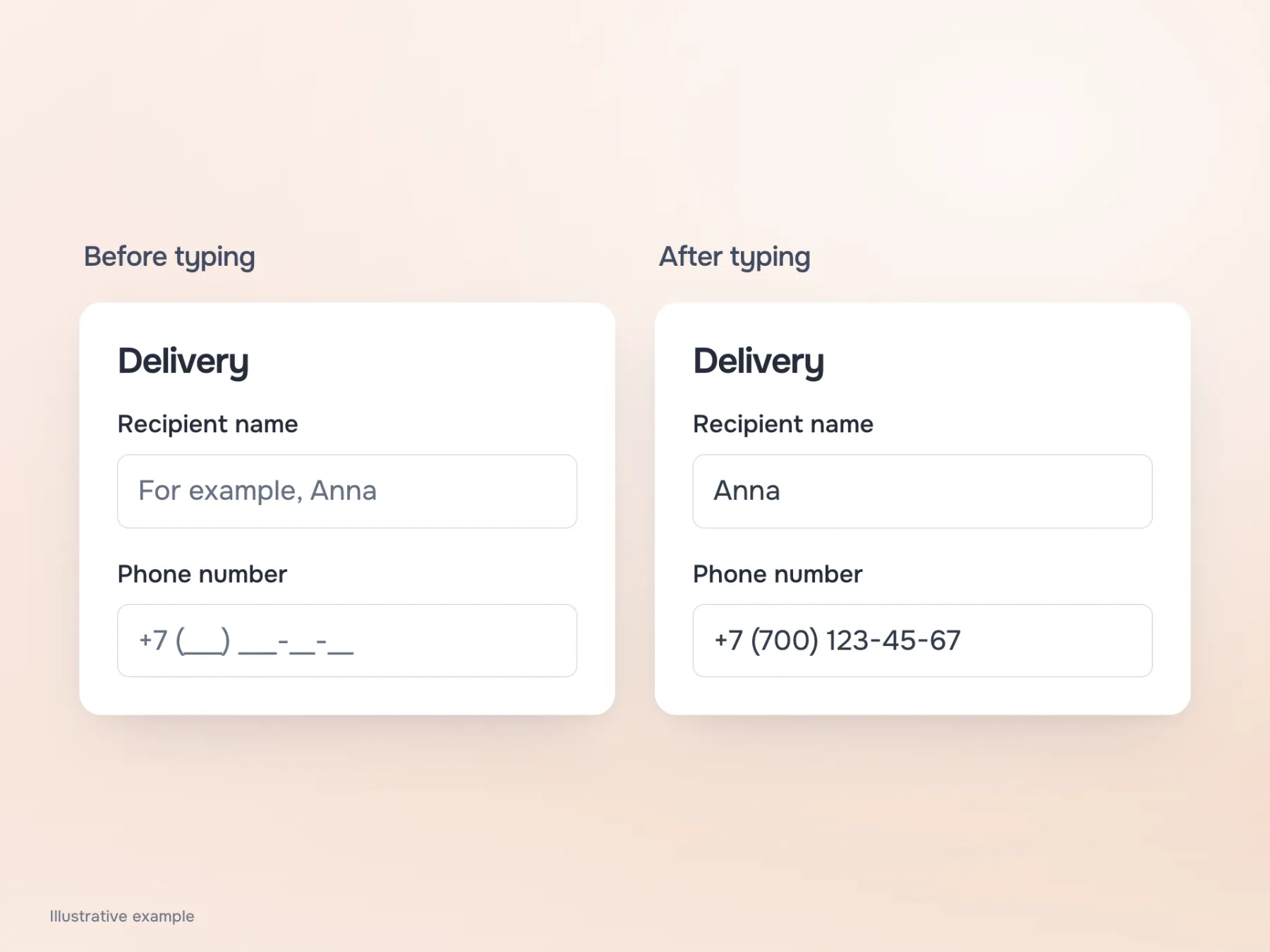
The delivery needs the recipient’s name, a phone number and an email for notifications. While all three fields are empty, their purposes seem easy to remember. But once actual details appear, you want to read the form differently: is the name spelt correctly, is that the right phone number, and will the notification reach the right address?
Labels above the fields let you check each value without going back to the beginning. They are especially useful for autofilled data: the person did not answer each question manually and may never have seen the original hints inside the fields. Keep a completed version beside the empty design from the start. If the filled version is harder to read, the form still needs work, however tidy its grid looks.
What changes on a narrow screen
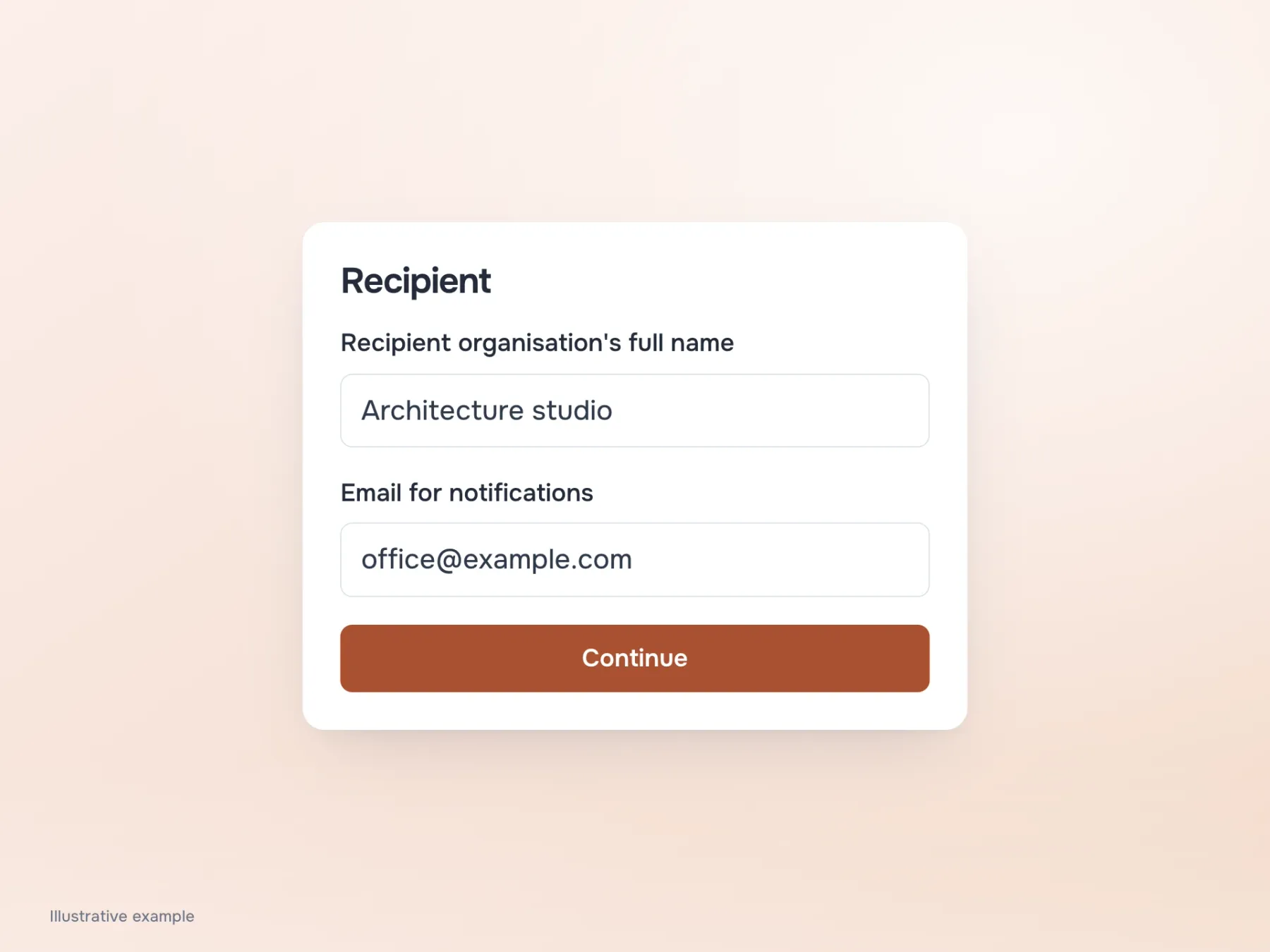
Try opening the same delivery form on a phone. A short “Name” could sit to the left of a field, but “Full legal name of the recipient’s organisation” takes much more space. If all labels share one narrow column, the label wraps and the value gets whatever width is left.
A label above the field gives the input the full row. A long question may occupy two lines, but the entered company name is easier to read. This is a useful starting point for this form, although it makes the screen taller. In a workspace where an operator changes familiar short settings all day, side labels may be more convenient. The difference depends on what people read and how often, so settle the debate about the “right side” using real fields.
Which field does the error belong to?
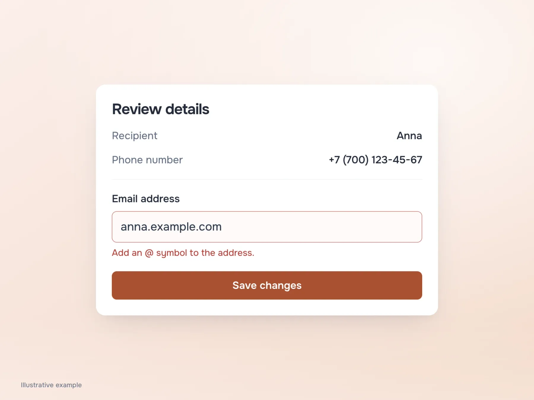
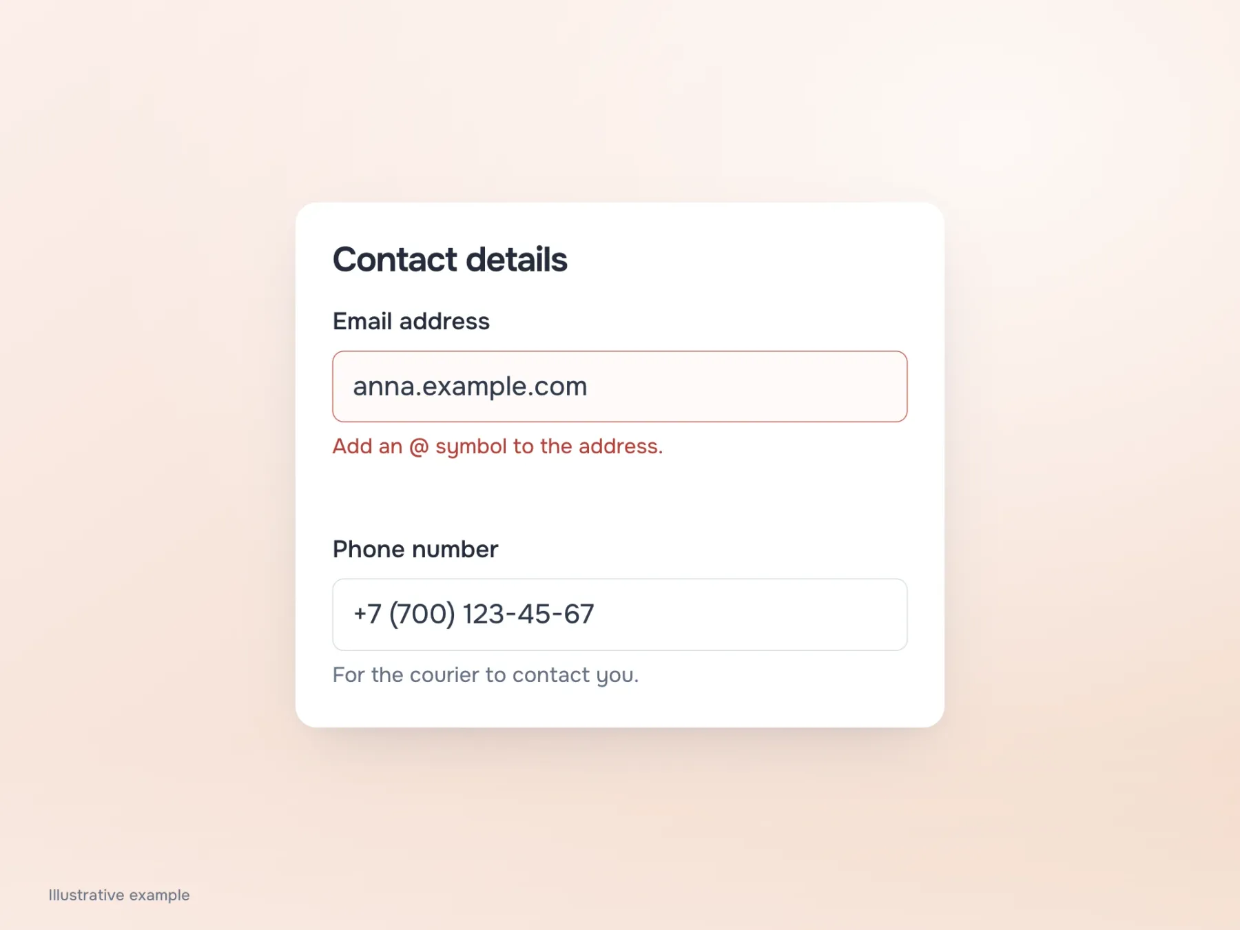
Back to filling in the form. Someone enters an email without @, and a red message appears between the email and phone fields. If it sits exactly halfway between them, you have to work out what is wrong: the address or the number? Red attracts attention but does not explain the connection to a particular answer.
Move the message closer to the email and leave a larger gap before the next question. The label, value, hint and error will then read as a group. The same relationship needs to exist in code: a screen reader should announce the field and its explanation. Visual spacing helps a sighted reader, but does not replace a programmatic association between label and input.
Reach the review step
After the email is corrected, the form looks calm again. But the person now has another task: making sure the delivery will reach the right recipient before sending it. Field names are still needed because they connect answers to questions. If a label only works before typing, its absence becomes particularly frustrating at this stage.
When checking a design, go through three connected actions: fill it in, correct an error and reread the completed details. Repeat the journey with enlarged text and real translations if the form supports several languages. A short Russian label tells you nothing about its length in Kazakh. Once questions and answers stay clear in all these states, you can judge label placement by how the form reads, not just how the empty screen looks.