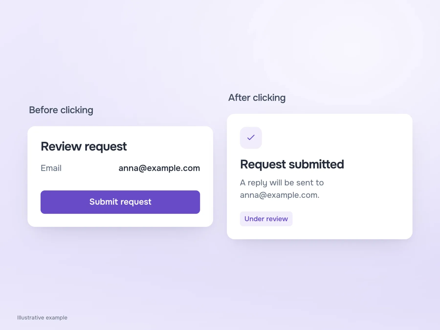
Imagine you have chosen a consultation time, entered your email and reached a button labelled “Done”. Your finger is hovering over it, but you want to check: can you still review your details afterwards, or will the request go straight through? One word makes you reread the whole screen, even though you seem to have finished filling it in.
The designer understands everything at this point. They remember the flow, the neighbouring screen and the note to the developer. The person using the form has none of that context, so a short label needs to connect their action to its result. Let’s work through a sample consultation request, from contact details to submission and an attempt to leave halfway through.
First, establish what the button does
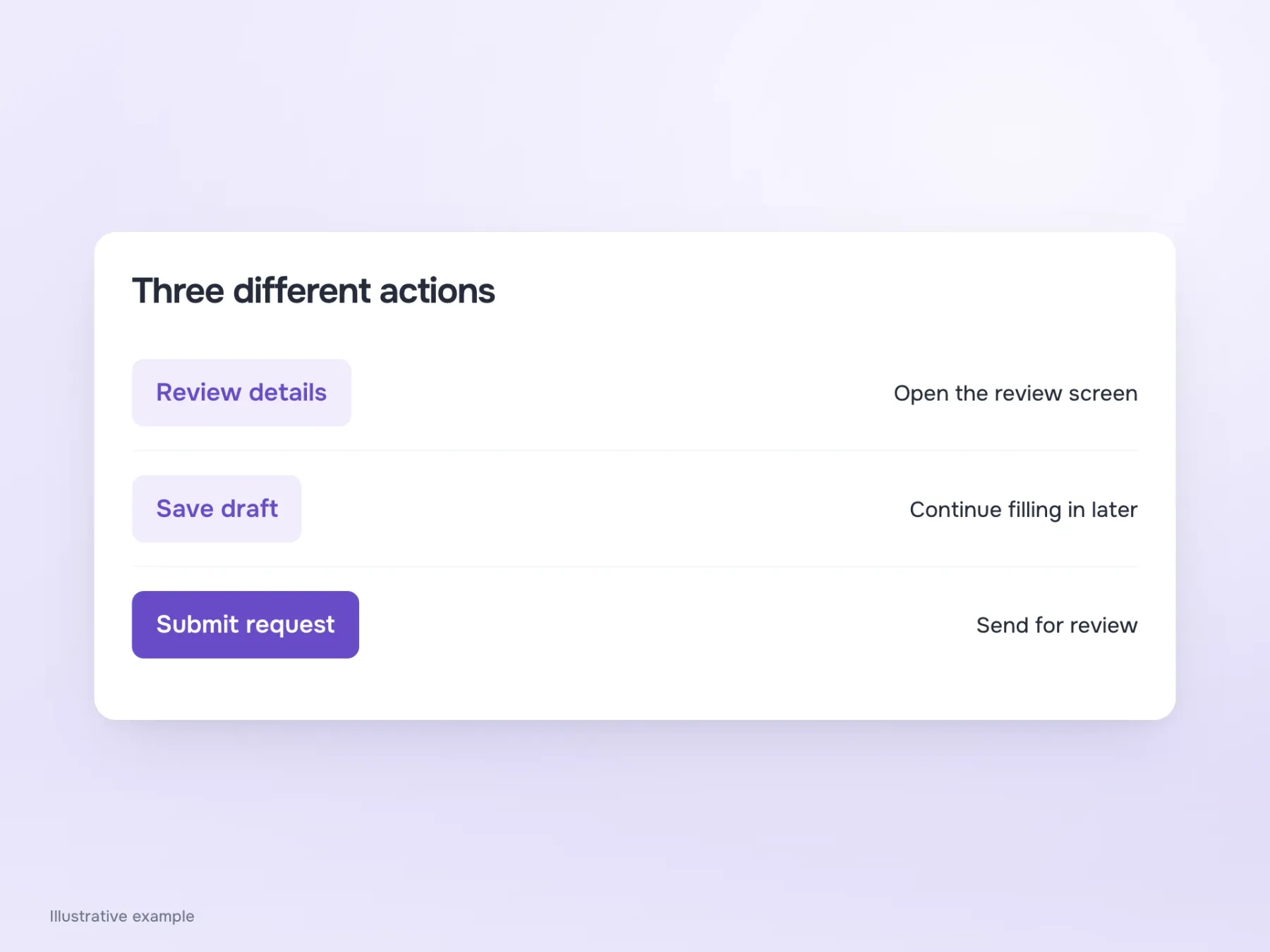
Our request may have several similar-looking screens with completely different actions. On one, the button opens a review; on another, it saves an unfinished response; on the last, it sends the request to a member of staff. Calling every button “Done” makes the interface look consistent, but makes those differences harder to understand.
“Review details”, “Save draft” and “Submit request” make the difference clear before the click. To choose those labels, first agree on what the service actually does. For example, “Book” might suggest that the time is already reserved. If a member of staff still needs to confirm it, label the action as submitting a request and explain nearby how the reply will arrive. Otherwise, a pleasantly short button promises more than the product can deliver.
Why “Continue” can be enough
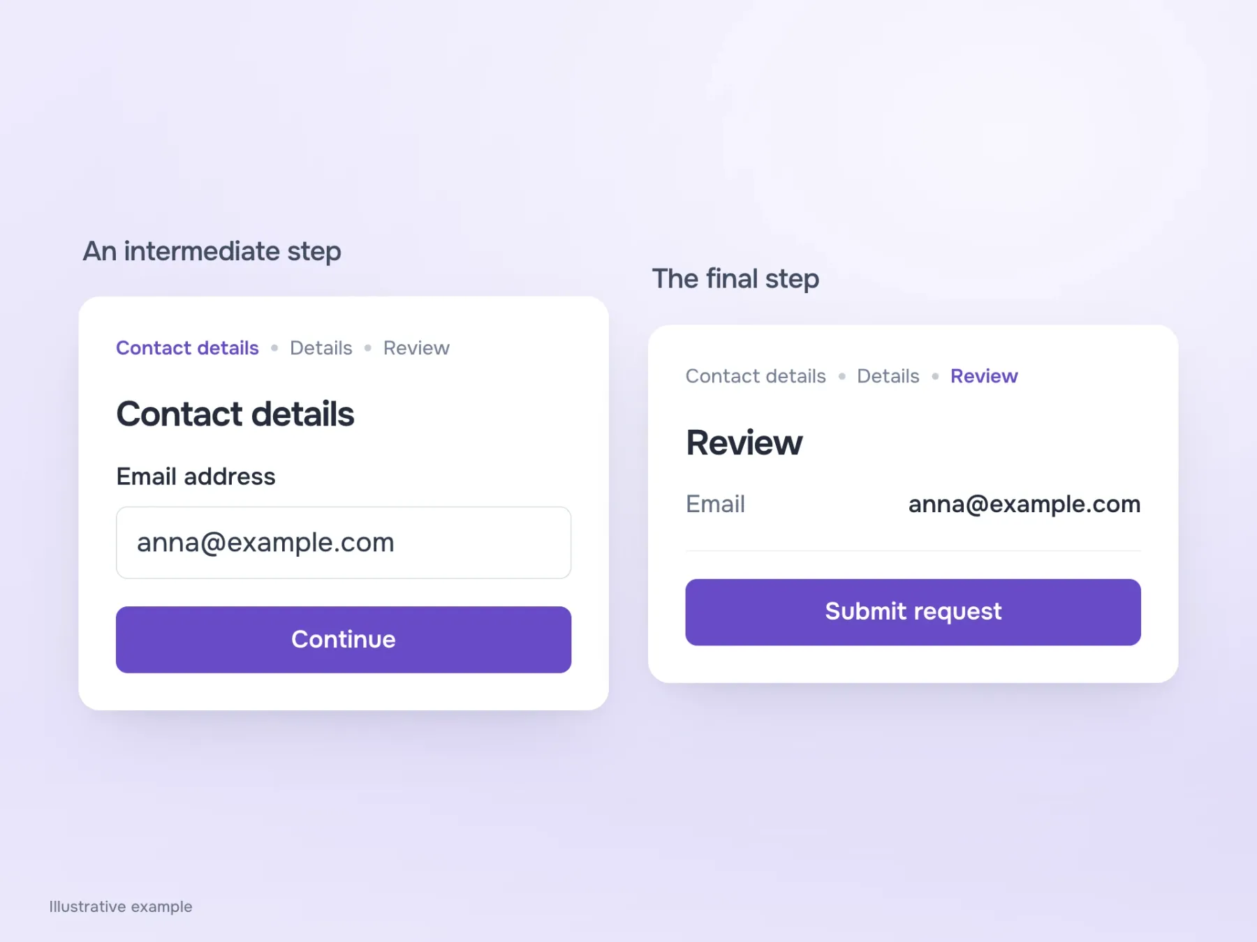
Back at the start of the form, the person sees “Contact details”, “Details” and “Review”, and is currently entering their email. In this context, “Continue” reads naturally: the form is still in progress and another step is ahead. Spelling out the entire route on every button would be cumbersome, especially when the step is already named on screen.
On the final step, though, the familiar label gets in the way. After moving forward several times, the person may expect another screen, even though the request will now be sent for review. This is where “Submit request” is useful. It creates a small but helpful pause: until now we were filling things in; now we are deciding to send them.
What exactly are we cancelling?
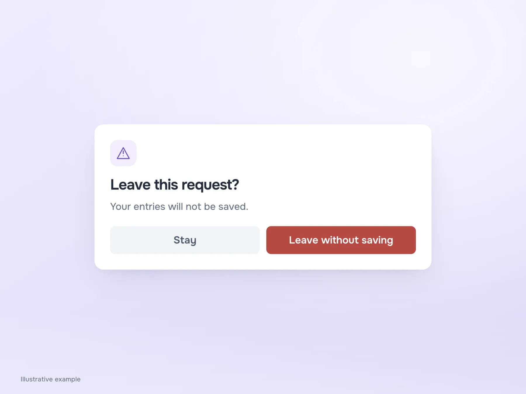
Before submitting, someone may change their mind and close the form. Imagine a dialog asking “Cancel filling in the form?” with “Yes” and “No” buttons. You have to translate those answers back into actions: does “No” mean stay, or don’t save? It is a particularly unpleasant puzzle when the data you have already entered is at stake.
“Stay” and “Leave without saving” remove that uncertainty. The warning explains what will be lost, and the actions let the person choose the outcome. But first check how saving actually works: if the draft is already on the server, there is no reason to threaten data loss. The dialog must reflect the form’s real behaviour, or people will stop trusting the warning next time.
A button does not have to explain the whole process
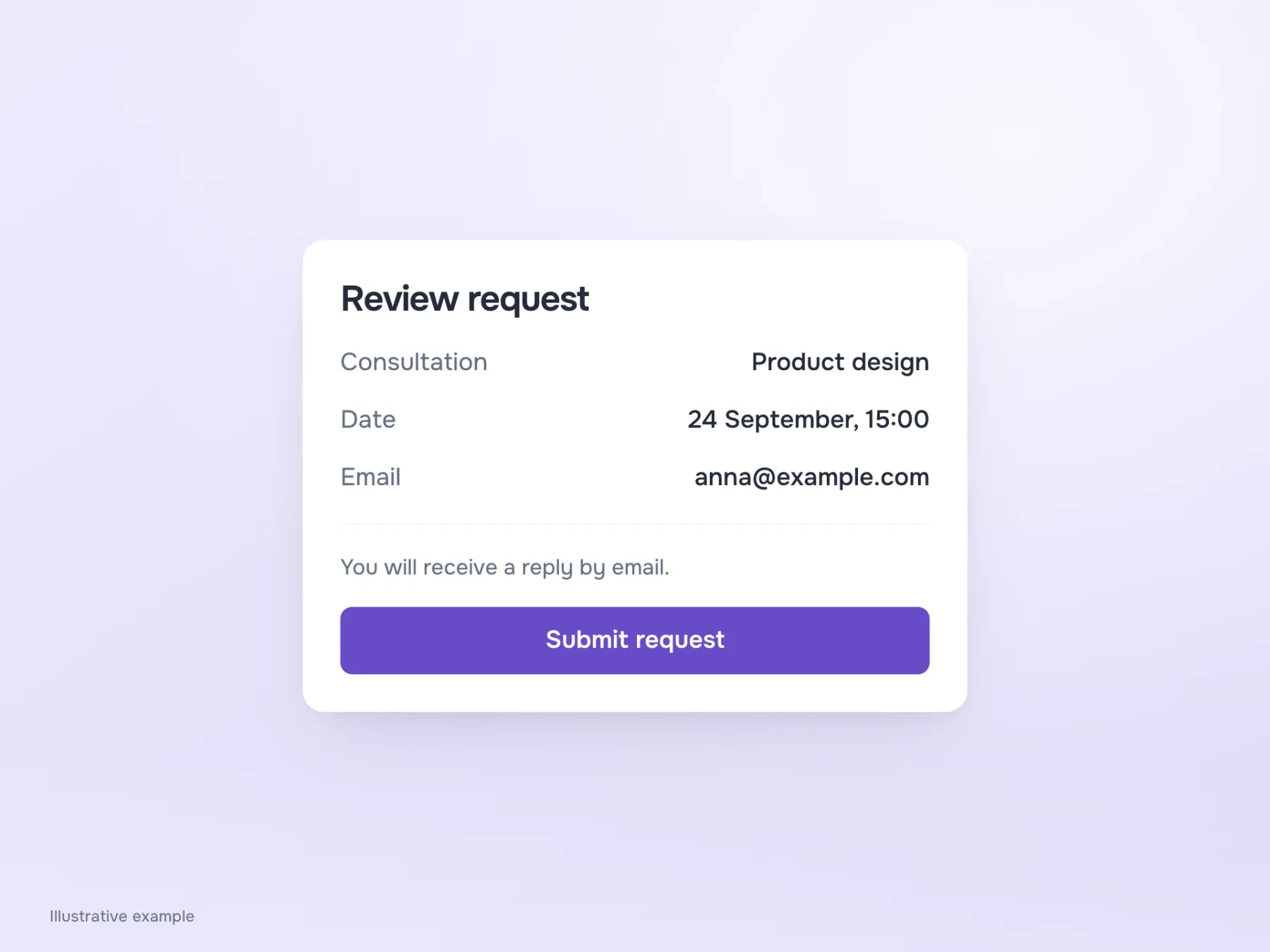
After clarifying everything, it is easy to end up with “Send your request to a specialist and receive a reply by email”. The meaning is there, but the button has turned into a paragraph. Separate the action from the details: keep “Submit request” on the button and explain the reply method nearby, where it can be read before submission.
The information stays on screen without overwhelming the control. Check this block at a narrow width and in every required language: wrapping onto another line is acceptable, but losing meaning to keep a label short gets in the way of a decision. If the button uses only an icon, it still needs an action name for screen readers. Otherwise, some people will never receive the explanation we have worked so hard to provide.
Find out what someone expects after pressing it
When the screen is ready, show it to someone whose task is to book a consultation. Before the final action, ask what they think will happen next. Do not give the answer away in your question: we need to hear their expectation, then compare it with the form’s behaviour.
If they expect a review screen but the request is sent immediately, look beyond the button. Perhaps the previous screen promised another step, or the heading described an unfinished request as a confirmed booking. In that case, revise this whole small stretch of the journey. Return to the same screen afterwards and ask again. The person should now understand that they are submitting a request and recognise the promised result in the confirmation.