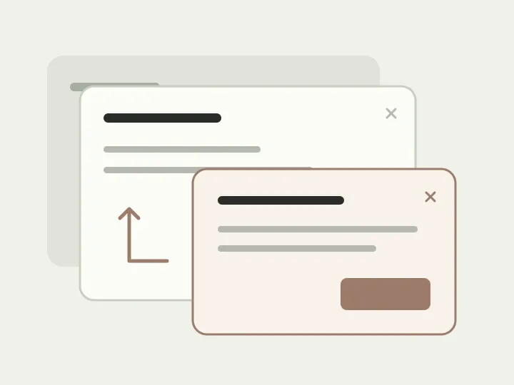
The request is almost ready; only the delivery address remains. You open a list, cannot find the address you need and press “Add”. Another dialog appears, followed by a confirmation after you fill it in. Several close icons are now on screen, and you want to dismiss the extras without losing everything else.
An interface like this is easy to assemble piece by piece. The address picker is convenient on its own, the add form is small, and a confirmation seems appropriate. Confusion appears when someone moves through them in sequence. Let’s follow this teaching scenario, tracking what changes at each step and where the person should return.
Are we saving an address or a request?
The person came to submit a request. It needs an address, but adding that address may have a separate result. If it is saved to a shared directory, it will remain there even if the request is cancelled. If it applies only to this delivery, a separate directory entry may never be created.
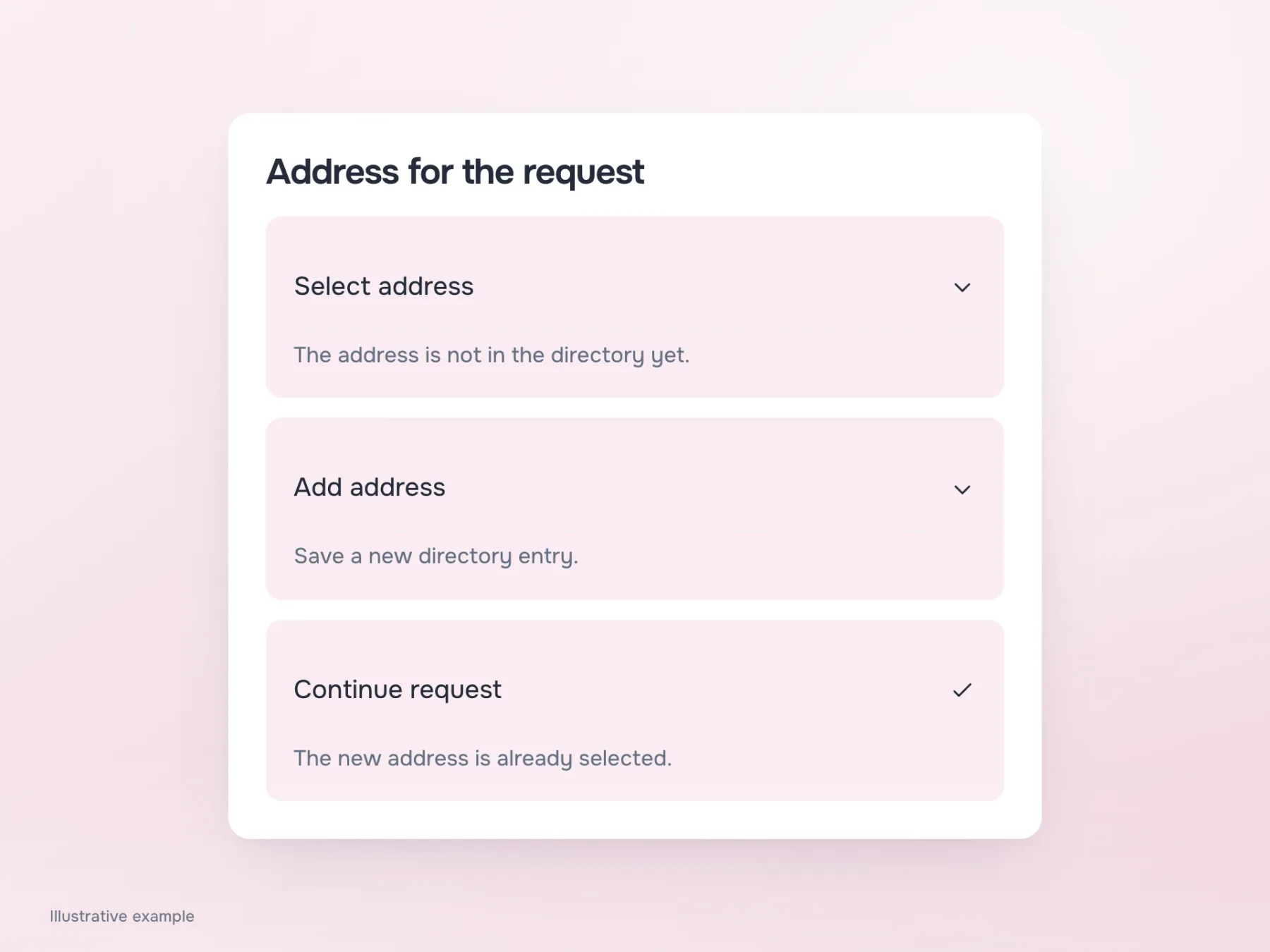
Establish this difference before choosing a layout. Otherwise, “Done” will close two different actions in the same way, leaving the person unsure where to find the address. For our example, let’s save it to the directory: the employee adds an entry, sees it in the list and continues the same request with that address selected. We now have a short sequence against which each transition can be checked.
Is one dialog enough?
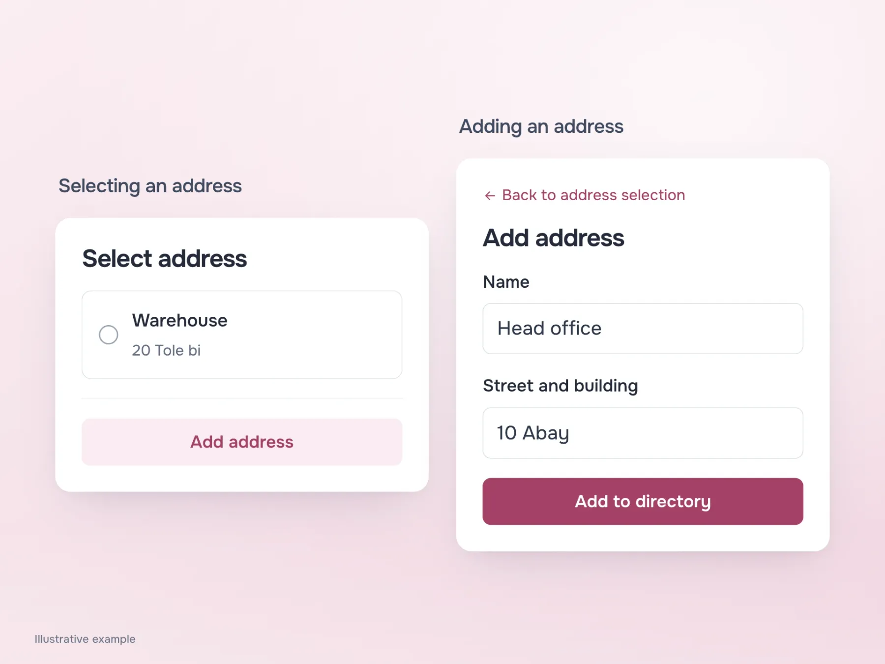
If a new address requires only a name and a street address, replace the contents of the current dialog. The list becomes an “Add address” form with “Back to address selection” above it. The person stays within one small task and sees how to go back a step. Do not disguise closing the whole dialog as that same return action: it does something different.
An address can be more complicated, though. If it requires a map, several documents and checking details, a cramped dialog starts to hinder the form itself. A separate page, with the request’s draft saved, provides more space and a clear route back. We do not have to keep everything in one rectangle at any cost: the person needs to continue where they left off after adding the address.
Where does the person return after saving?
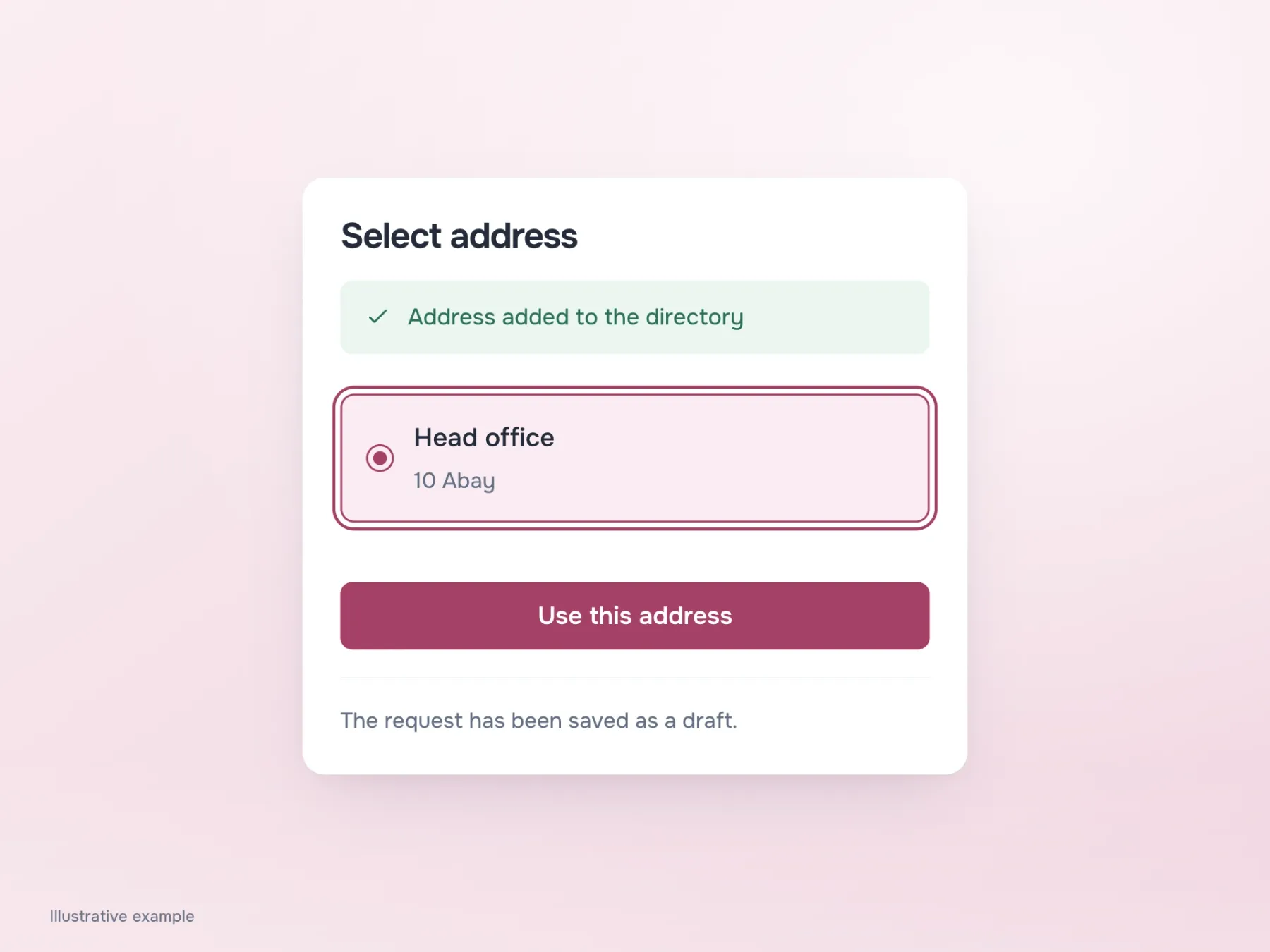
In our short scenario, the address is added successfully. Simply closing the form is not enough: the new entry must appear among the available options, and the person must see it is selected. Otherwise, they will start searching the list again or assume saving failed.
Check the same transition with a keyboard. Opening a dialog moves focus inside; closing it returns focus somewhere meaningful. If focus stays on a hidden field, the next Tab may take the person far from where work resumed. Cancelling the addition needs an honest result too: the previous selection remains, and no successful-save message appears.
What if the address cannot be saved?
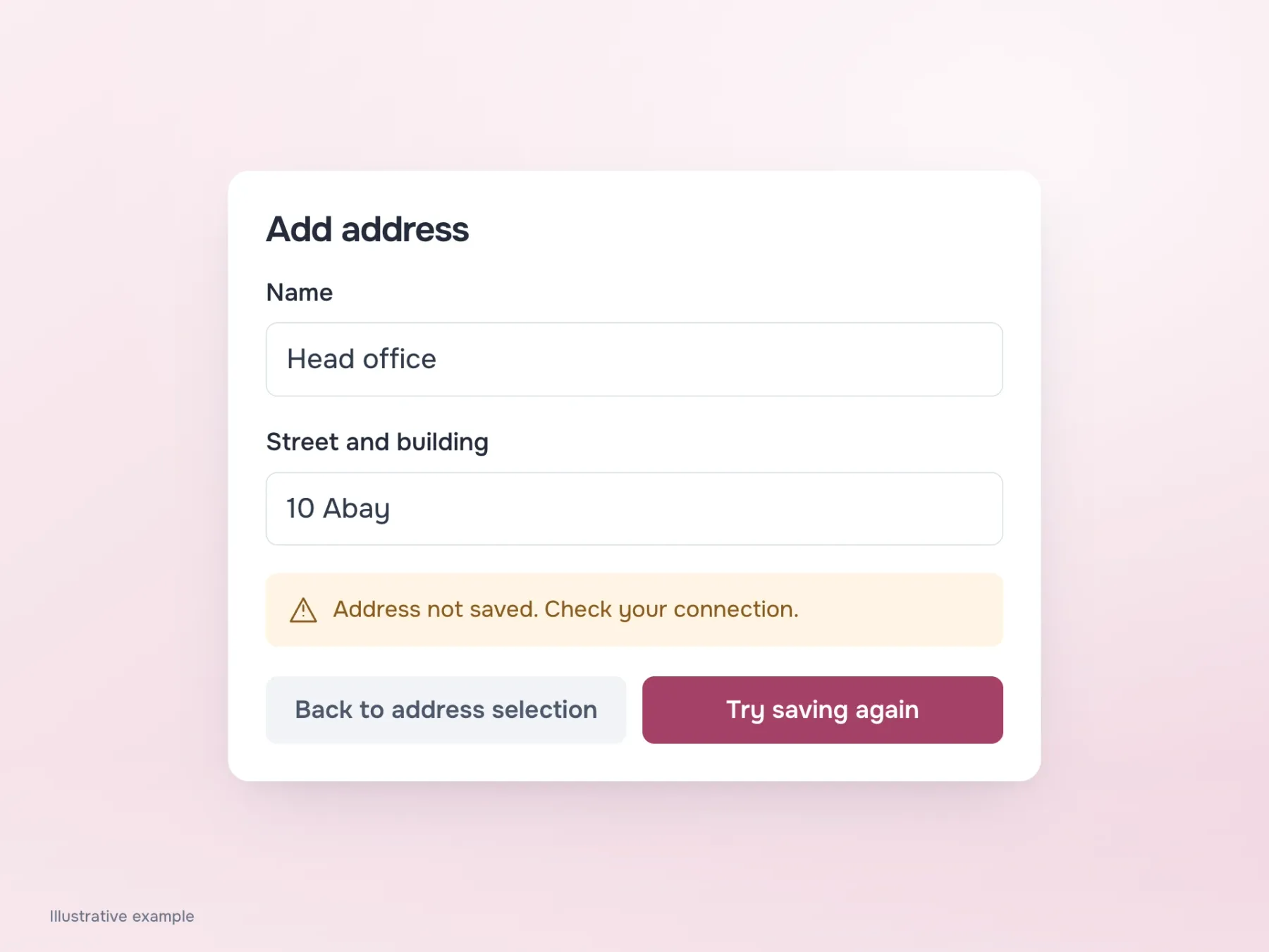
Repeat the journey with a network error. The person presses “Add to directory”, but the server does not respond. If the dialog disappears, they have to guess whether the entry was added. If the fields clear, they must enter the address again, even though their actions did not cause the error.
Keep the entered information on screen, explain that the address has not been saved yet and offer a retry. Then check returning to the list, closing the dialog and reopening it. The request must stay accessible, and retrying must not silently create a duplicate address. Once the route is clear after both success and failure, the number of dialogs stops being the main debate. The person has added the address, knows where it was saved and can finish the request.