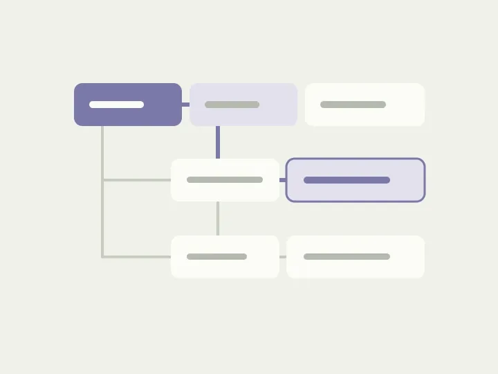
You are working on Project Alpha’s documents. To open them, you expand the client, then the project, then the folder section. It works, but a minute later you need the same project’s tasks. You scan the long tree again for a neighbouring branch, trying not to switch to another client by accident.
At this point, it is tempting to remove a couple of levels and call the menu simple. But nesting may represent useful relationships: in a file manager, for instance, a tree makes moving between folders convenient. In our sample agency workspace, let’s first examine what each level contains and what work the person does between transitions.
Choose a project, then work within it
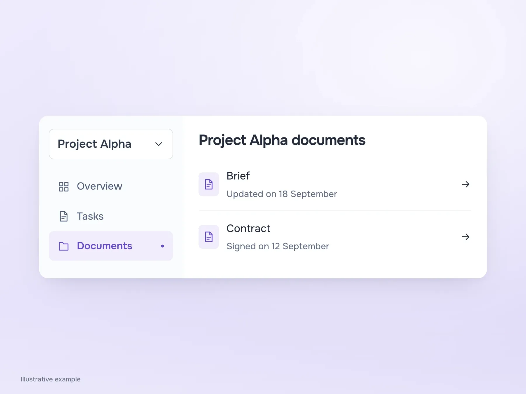
In our example, the client and project determine whose data we are working with. Documents and tasks are sections of that project. Put everything in one tree, and the same sections must repeat under every project, with people having to find them again each time they switch.
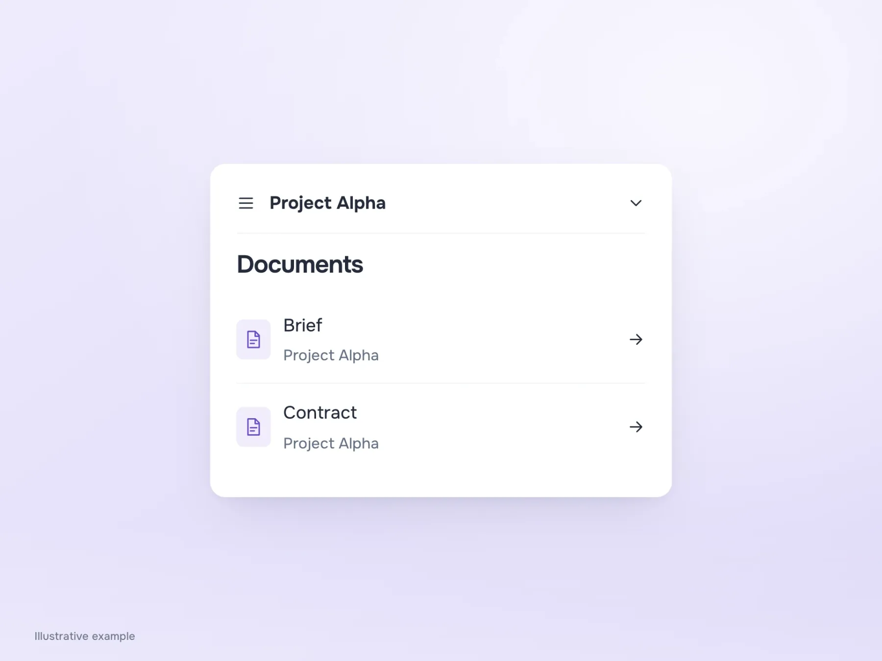
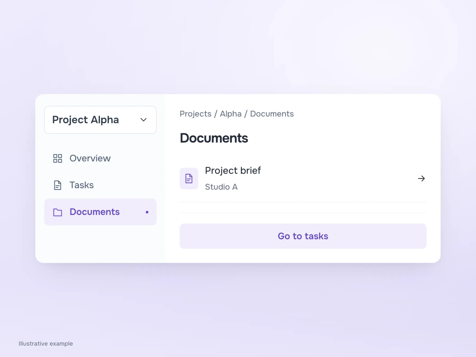
Project selection can move into a separate switcher. The person chooses Alpha once, then sees “Overview”, “Tasks” and “Documents” in the menu. The project name remains above the workspace, preserving context between sections. But if someone needs to compare files from different branches, constant project switching may slow them down. A tree is still worth considering in that case: it shows the relationships they need to explore.
What happens when the name is clicked?
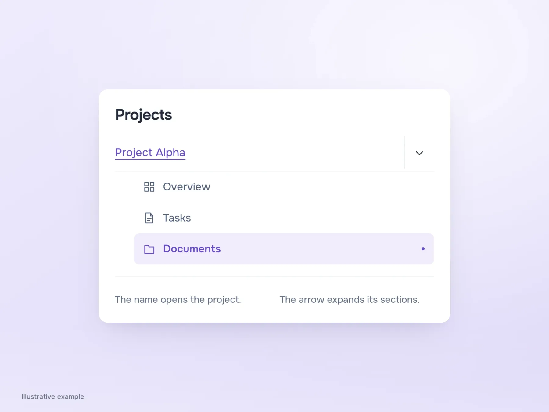
Suppose we keep the tree. We now need to decide what “Project Alpha” does: open an overview or expand nested sections. If its behaviour changes with the state, people have to try it and see. It is particularly awkward to lose the current page when all you wanted was to expand a branch.
Separate the actions: the name opens the project, while an adjacent arrow expands its contents. Give the arrow a proper target area so people do not have to aim for a few pixels on a phone. After navigation, the current branch should remain visible. Someone arriving at a document through an email link also needs to understand which project they are in, even if they never expanded the tree themselves.
Why breadcrumbs alone may not be enough
“Projects / Alpha / Documents” clearly shows where the page is and how to go up a level. It is tempting to remove the tree, keep this trail and free up space. But try moving from an open document to Alpha’s tasks: that neighbouring section is not in the breadcrumbs.
Simplification therefore needs to preserve frequent moves between sibling sections, not just the return to a parent page. In our workspace, a few persistent project menu items can do this. On a phone, the menu itself can be hidden, but keep Alpha’s name visible. Otherwise, once navigation closes, documents from different clients look alike, and someone may notice a wrong project selection too late.
Fix the point where someone gets lost
Before redesigning, look at a specific failure. If someone cannot name the current project, examine how context is shown. If they cannot find lower sections, check the tree’s length and scrolling. If they expand the wrong branch, look at the labels and their relationships. Simply removing a level will not necessarily fix all these problems.
After the change, try two routes: find a document from the home page, and open it through a direct link, then move to the same project’s tasks. This tests both an initial visit and everyday work between sections. Simplification succeeds when people know which project they are working in without spending every transition reconstructing that context.