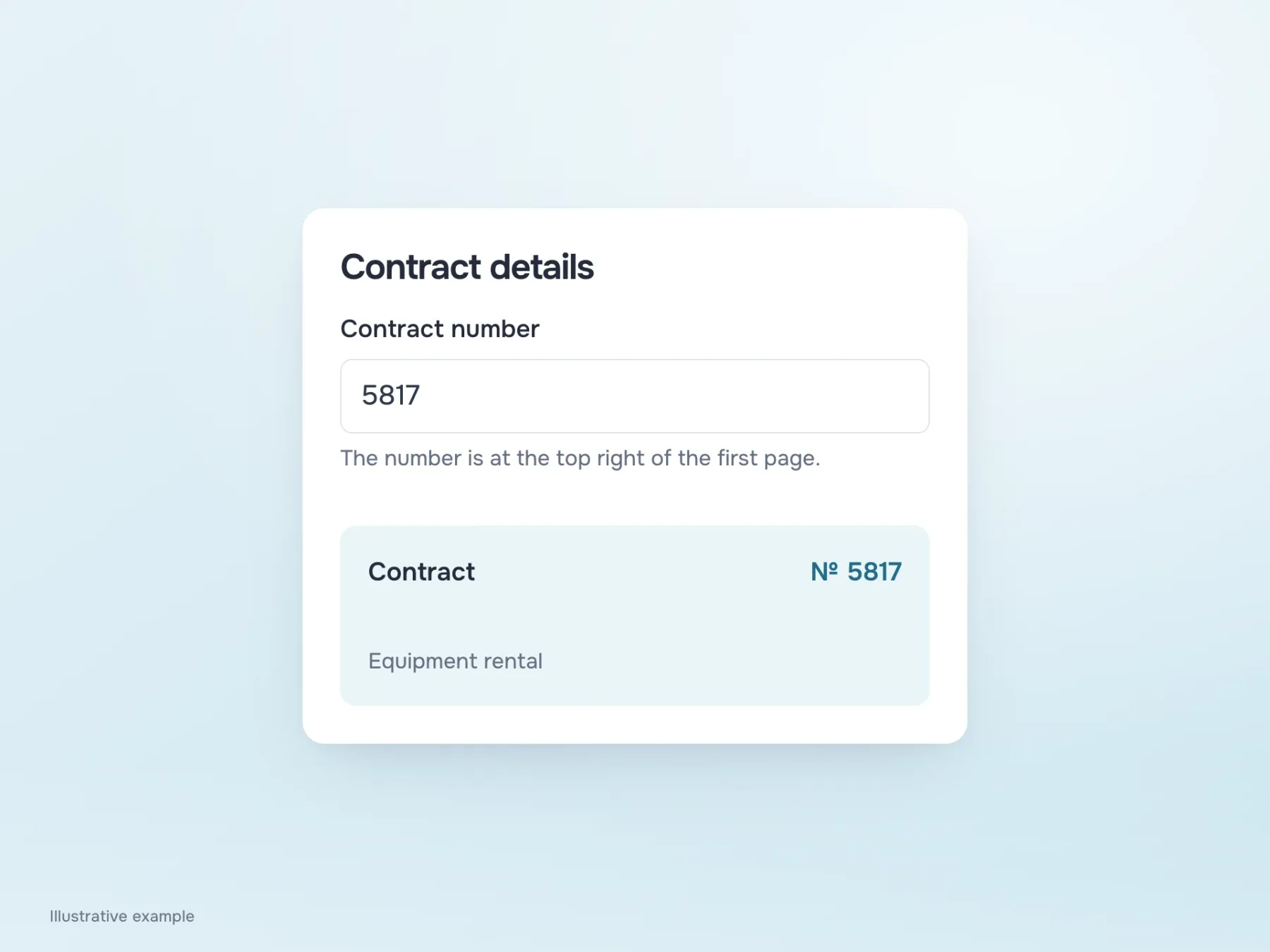
You open an equipment rental form, reach the contract number and stop. The document has several numbers: the contract, the request, the appendix. Beneath the field, a hint says “Enter the contract number”. Thanks. That was the part you already understood.
What is missing is a specific detail: where to find the number and how to tell it apart from the others. In our teaching example, “The number is in the top-right corner of the first page” would help. Let’s start there: what to explain beside a question, when an error message is needed, and why changing the input itself can be more useful than adding another paragraph of help.
One question, three different pieces of text
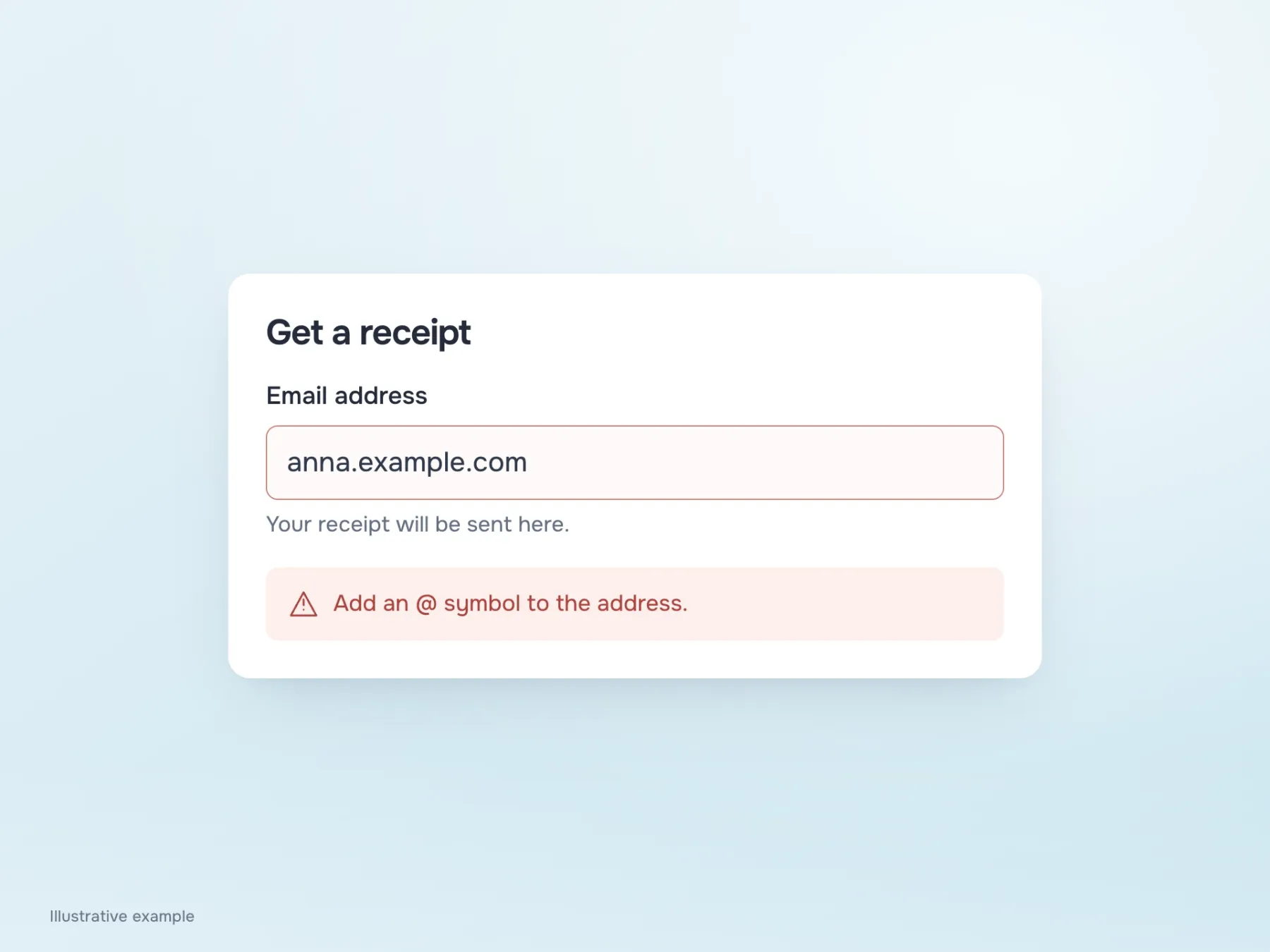
Start with a more familiar field: the email address for a receipt. “Email address” names what needs to be entered. Underneath, we can add “Your receipt will be sent to this address”. The person now understands why the service is asking and can decide which inbox to use.
Suppose they leave out @. There is now a third task: explaining what to correct in the value already entered. “Add @ to the address” helps, but does not replace the explanation about the receipt. If an error replaces the hint, information disappears just when the person returns to the field. Keep both texts nearby, each doing its own job. And do not claim the inbox does not exist if the app has checked only the address format.
The hint is still needed after the first character
Back to the contract. Putting the explanation inside the empty field seems convenient: less space, a cleaner form. But the person starts copying the number, enters the first digit, and the hint disappears. To check the rule again, they have to delete what they typed or rely on memory.
Persistent text below the field removes this small frustration. If the number’s location is hard to explain, show a fragment of the document nearby. A question-mark icon can hold extra detail, but do not hide an essential requirement behind it. Help must also work on a phone and with a keyboard: not everyone can hover a mouse. In implementation, associate the explanation with the field so a screen reader can read them together.
Why are we making people remove spaces?
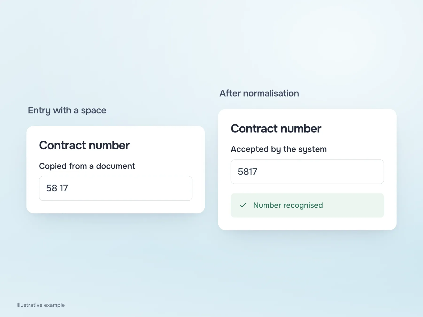
The person has now found the number and copied it from the document. Instead of 5817, the field contains “58 17”, and the form asks them to remove the space. It is tempting to add “Enter digits only, without spaces” so the next person avoids the error. But first discuss with the developer whether this restriction is needed at all.
If the space has no meaning, the system can remove it and accept the number. Both the error and the need to explain it in advance disappear. This only works when the transformation is unambiguous: silently changing meaningful characters is risky. Still, the question is useful whenever the help text grows longer than the field. Perhaps we are teaching people to work around a restriction that could be removed.
Read the form with its answers
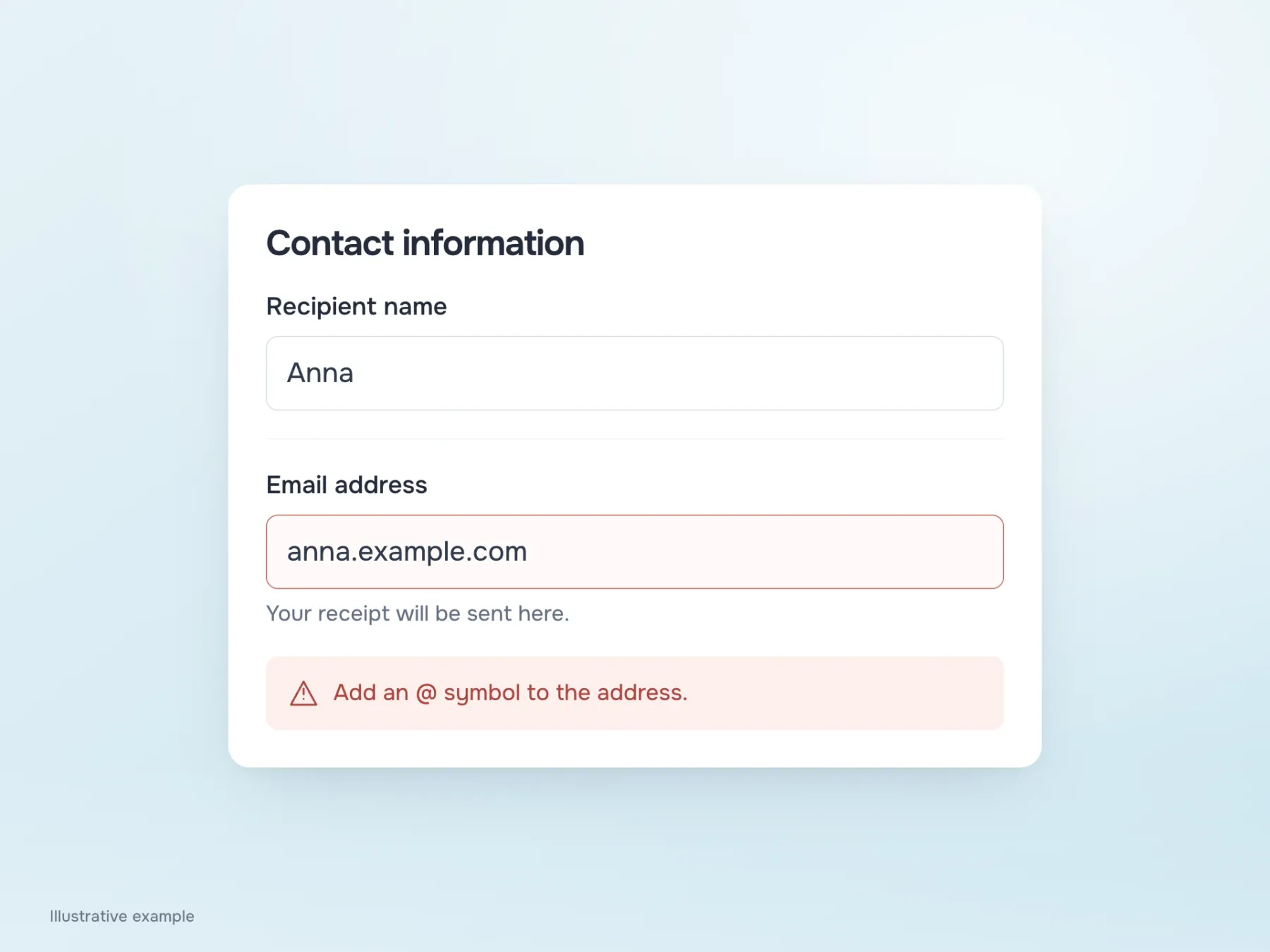
After these changes, fill in the whole form and see how the text works beside real values. The name may need no help at all. The contract keeps its hint about the first page; the email keeps its explanation about the receipt. They occupy different amounts of space because they address different difficulties, and that is fine.
To check whether text is needed, remove explanations one at a time and see what information is lost. If all that disappears is a polite repetition of the question, the form becomes easier to read. If it is no longer clear where to find the number, the hint was useful. Then check the errors: they should help correct an answer while keeping nearby the information without which someone would get stuck at the same field again.