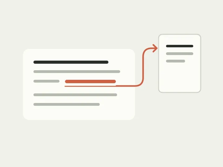
You enrol in a course and receive an email: the syllabus is here, the timetable is here, and the refund policy is here too. It all makes sense as you read it from start to finish. But that evening you want to check a class time quickly, and your eye catches three identical links. You have to reread the sentences to remember which one you need.
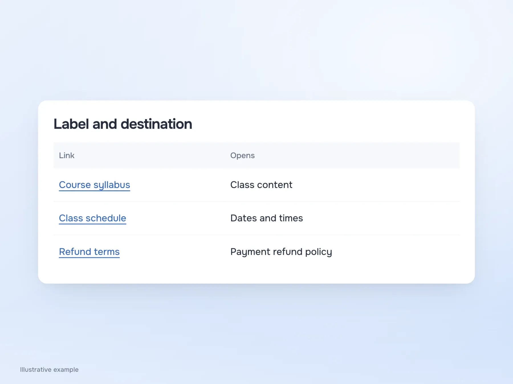
This email can be improved without a redesign. Let’s call the links “Course syllabus”, “Class timetable” and “Refund policy” so they differ even at a glance. We could stop there, but let’s take our teaching example a little further: what will someone see after following a link, and will it match what the email promised?
If we call it a timetable, show a timetable
Suppose “Class timetable” links to a pricing page. Class times are indeed somewhere further down, so the information is technically there. But the person came to find out when a class starts and is first asked to think about a purchase. The frustration is understandable: they seemed to choose the right link, but arrived in the wrong place.
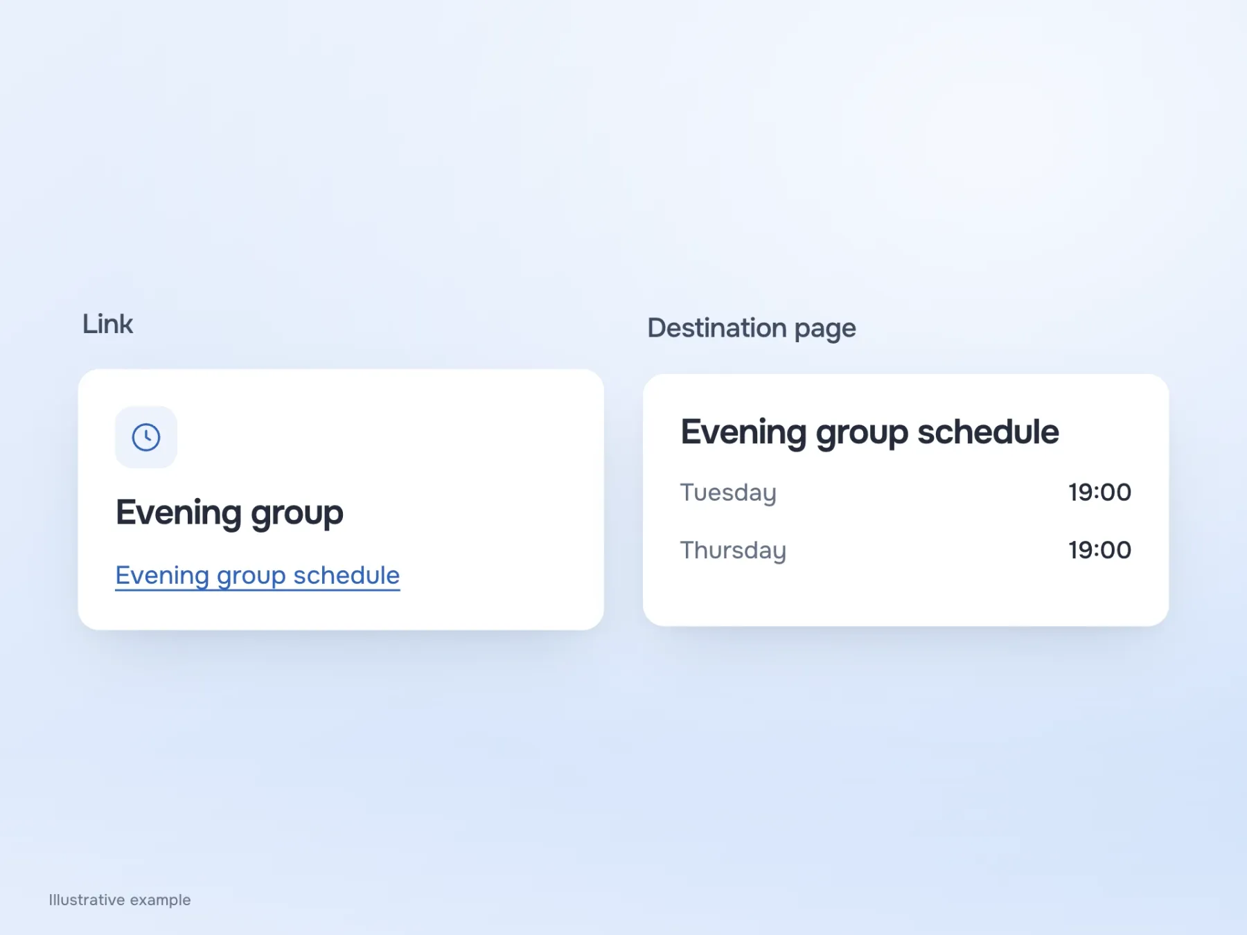
That is why it helps to open a link’s destination while writing its label. If it contains the evening group’s timetable, say so. If the syllabus is a PDF, the format and file size may be useful nearby. These details help someone decide whether to open it now or later. “Download the syllabus” and “Open the syllabus” also promise different actions: viewing a file in the browser does not necessarily mean it has been saved to the device.
Sometimes the answer is already nearby
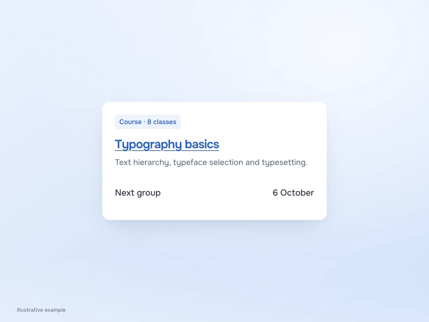
Let’s move from the email to a course catalogue. A card has the title “Typography basics”, a short description and a “Read more” link. Here, that link is easier to understand because it is surrounded by information about one particular course. Declaring every “Read more” an error would be too simplistic.
But we could try linking the title itself. It would then both describe the course and open its page, making the repeated action below unnecessary. We still need to check the whole card: where it can be clicked, how keyboard focus appears, and whether another button with a different action has ended up inside it. Elements that are visually close are not necessarily associated for a screen reader, so this needs checking in the working interface too.
The reader needs the syllabus
Back to the email. “Click here to view the syllabus” can become “Course syllabus”. The person is looking for the material and usually already knows how to use a link. What remains is precisely the information that helps them choose where to go.
This is not a reason to ban “click” from every instruction. If a help article explains how to find a particular button in an unfamiliar app, describing the action may be necessary. In our email, though, a mouse instruction distracts from the content. The same applies to long URLs: a title is more useful when reading a syllabus, while during domain setup the address itself may be what someone needs to copy. Link text depends on the job people intend to do with it.
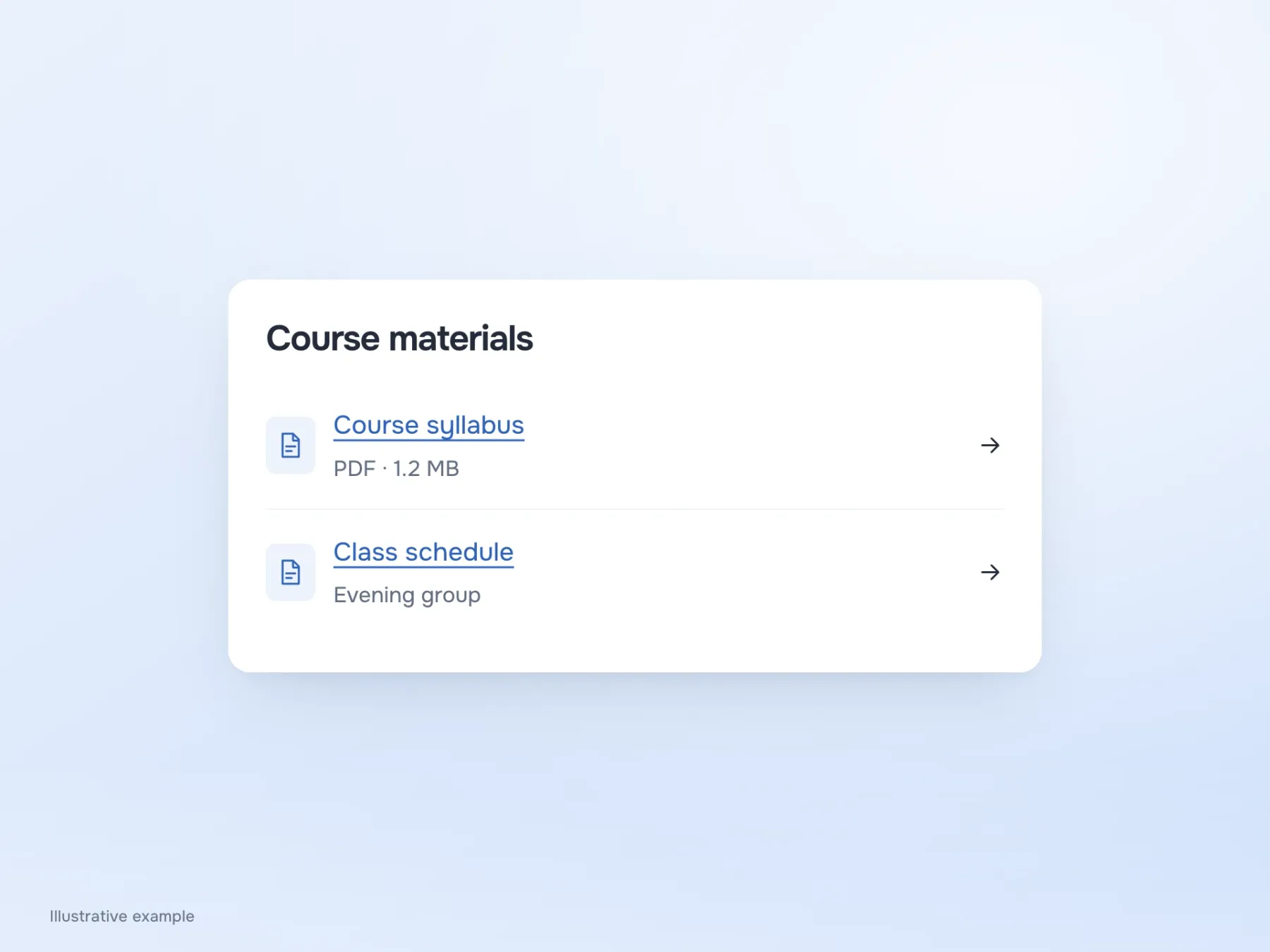
Check where the promises lead
Once you have edited the email, place its link labels beside the names of the pages they open. This comparison quickly exposes oddities: identical labels for different documents, a promised timetable leading to a purchase page, or “download” opening an ordinary article. It is easier to catch these now, while fixing them takes only a couple of lines.
Then give someone a specific task, such as finding the rules for rescheduling a class, and see where they go. If they confidently choose the wrong document, the problem may be how the material is organised: rescheduling terms are hidden in refunds, and the label does not explain that. Replacing “here” will not be enough. Help the person recognise the relevant topic and, after following the link, find the answer that made them open the email.