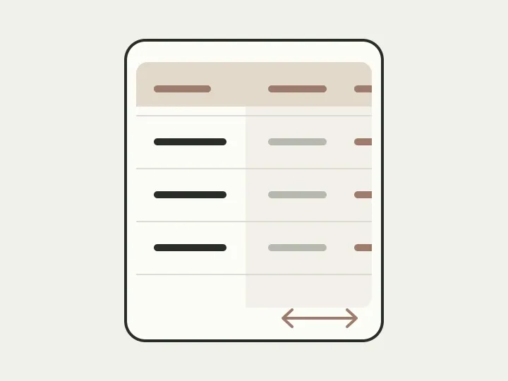
Imagine checking a transfer on your phone. You open payments and find the recipient, but the amount is beyond the right edge. You scroll the table, read the amount and are no longer sure who it belongs to. Back to the name, then back to the money. You wanted to check a payment, but now have to hold a whole row in memory too.
The first thought when working on this screen is to turn everything into cards. Each would contain a recipient, amount and status, with nothing sliding sideways. For one payment, it looks convincing. But try comparing five transfers: one is at the top, another is already below the screen, and the numbers need remembering again. Let’s examine this teaching example before replacing one awkward layout with another.
Read one payment, compare several
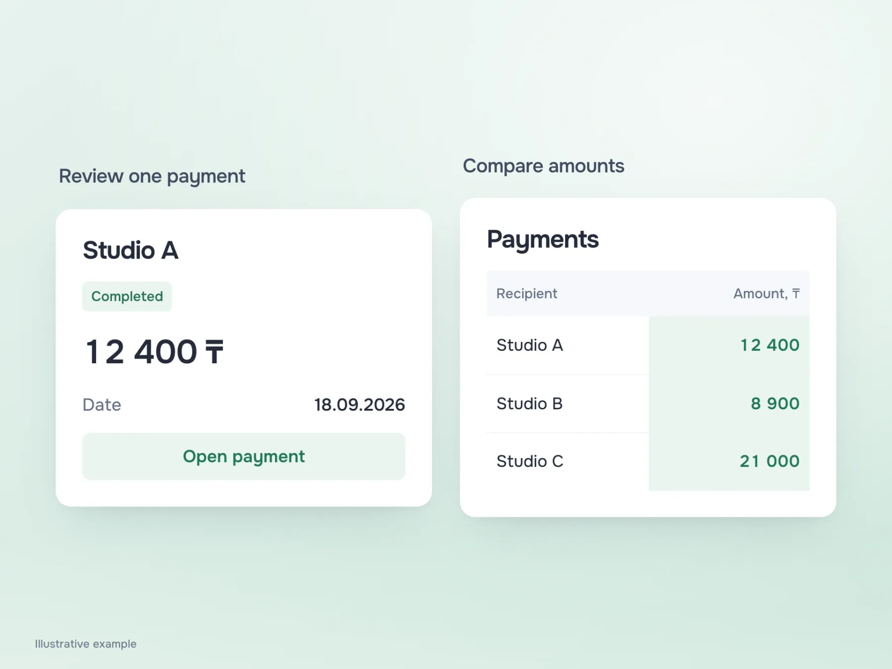
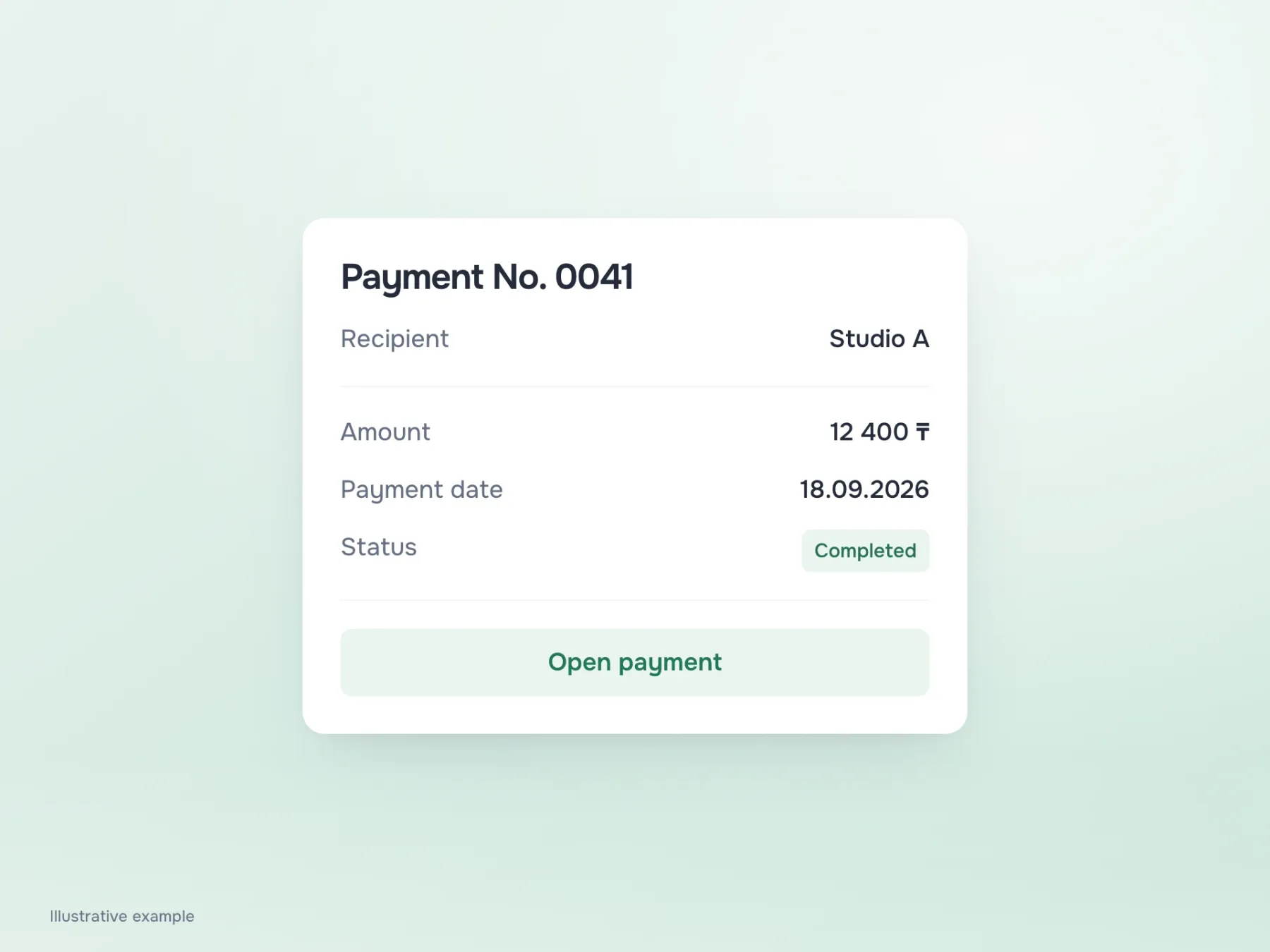
Start with Studio A, which was sent ₸12,400. To check that the money went through, opening a card is convenient: it gathers everything in one place. The amount, date and “Completed” status sit beside the recipient. There is no need to find the table header or swipe back and forth: read the record and get the answer.
Now the task changes. We need to see which of three transfers was largest. A shared amount column helps: your eye runs down the figures and compares them easily. Three tall cards would move some of that work into memory. A mobile screen can therefore keep a table, just with fewer columns. When comparison requires every field, horizontal scrolling can remain inside the table itself. Make it clear that content continues beyond the edge and ensure it can be reached.
What to keep in the list
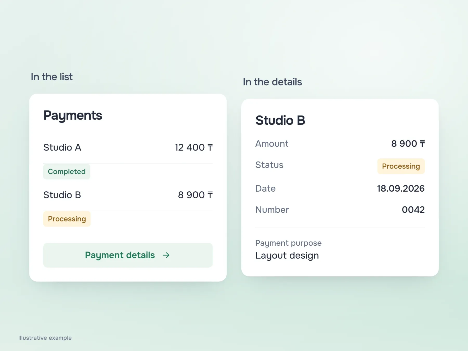
Suppose we choose a compact list and put full details on a separate screen. It is tempting to keep only a name and amount: two columns, a clean screen, everything fits. But Studio B’s payment is still processing. Hiding that status in the details would stop the list answering the question it was opened for: has the payment gone through, or do we still need to wait?
First write down what the person intends to do with the payments. Checking completion requires the status immediately. Reconciling expenses needs amounts, while finding the latest transfer calls for a date. This small analysis helps agree what can be left off the first screen. An operation number and a long payment description can wait until the record is opened if they are not needed to choose it.
Reducing the type size is especially tempting here: a little smaller, and everything will fit. But the person opened their bank to understand their money, not to inspect tiny text. Keep the few necessary details readable and provide a clear route to the rest.
Cards need labels too
When a row becomes a card, its column headings are easy to lose. In the table, it was clear that “18.09” was the date and “12,400” the amount. On a card, that connection no longer happens by itself, especially when a payment number and other figures appear nearby. Move the names as well as the values.
Check currency and formatting at the same time. If one amount has a tenge symbol and another is shown in thousands without explanation, comparison is unreliable at any screen width. Labels and units help people interpret data correctly; preserve these relationships for screen readers too. A table should communicate which column a value belongs to, and a separate card should name its fields.
Now try the payment that breaks the layout
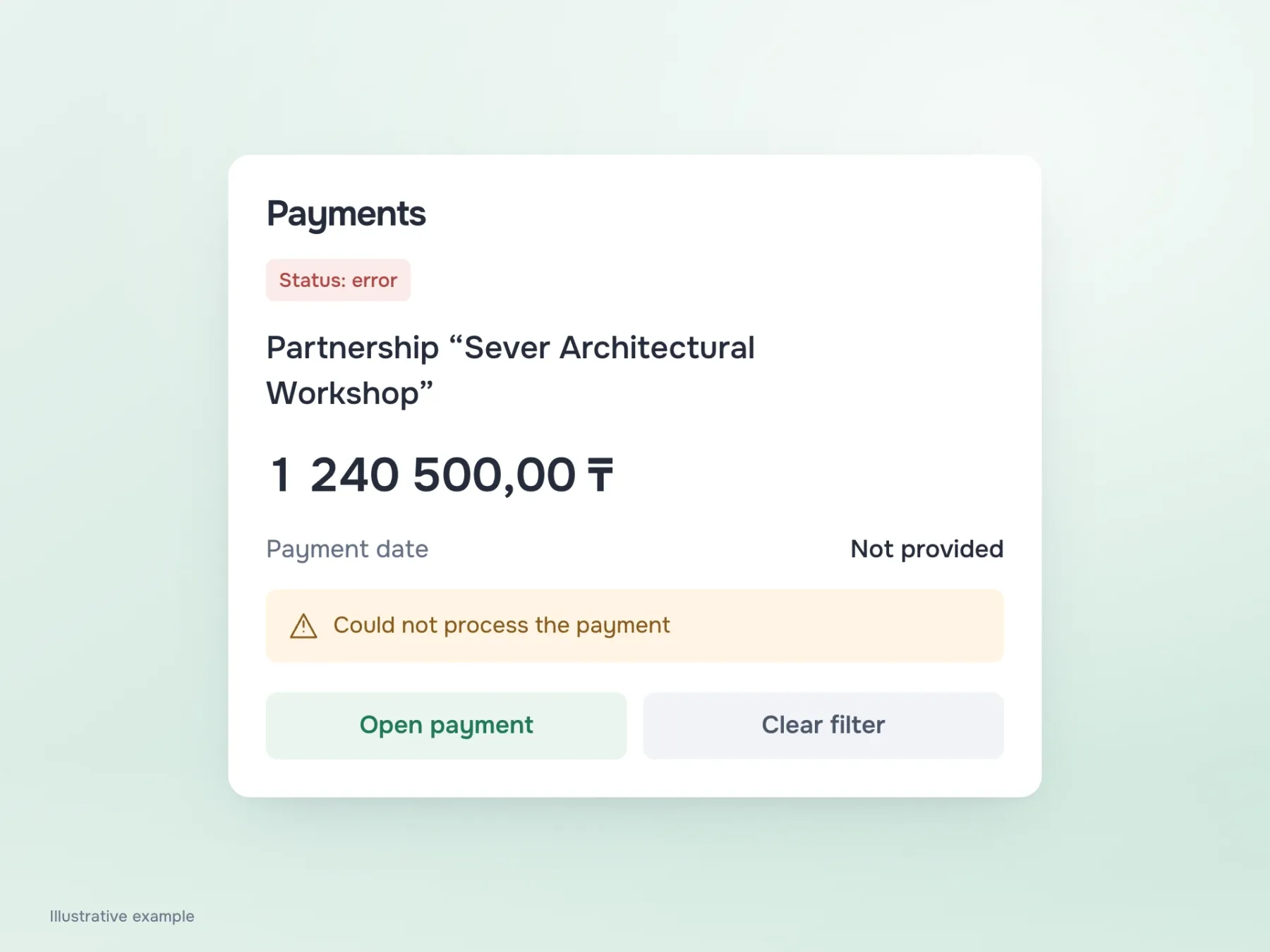
With “Studio A” and a tidy five-digit amount, almost any layout looks decent. Replace them with a long organisation name, an amount over a million, a missing date and a failed operation. It immediately reveals where rows need more height, what gets cut off and which message crowds out other data.
Then repeat the journey with enlarged text and a keyboard. If an errors filter is active, keep it visible, or someone may think the other payments disappeared. If scrolling is present, check that the table itself moves and the last column is reachable. These checks bring the design back to the task: can someone find a transfer, understand its state and compare the amounts they need? Once those answers are clear, choosing between a table and cards becomes much easier.