Projects

Telecom · UX/UI audit

Balance, plan and paymentcome first

UX/UI audit and design proposal

In the original account screen, the balance, plan and account actions sit alongside advertising and additional services. The proposal groups the account, balance and top-up in one block, gives the plan its own area and moves requests and support into the bottom navigation. Compact advertising cards remain above the balance.

Original screen
Proposal

Account and payment

Original screenAn advert separates the account number from its balance. Payment lives in a separate card.

ProposalAccount, balance and top-up share one card. The amount and action belong to the selected connection.

Current plan

Original screenThe home screen has no dedicated current-plan block. Promotions occupy two advertising placements.

ProposalThe active plan and monthly price share a dedicated card. Other offers have a separate entry.

Payments and usage

Original screenPayments and usage details sit in the general section grid below the balance.

ProposalDescriptions separate payment history and automatic payments from spending, data and calls.

Core tasks

Original screenThe bottom bar contains TV+, money, chats and music, with no direct entry to requests or support.

ProposalConnected services, requests and support move to the bottom bar. Other products share a services section.

Before the data arrives.

Placeholders follow the positions of the banners, balance, plan and two actions. The bottom navigation remains visible while loading.

Proposal · loading

A home screen with recommendations.

Here, the store, TV+ and chats have direct entries in the bottom bar, while support stays on the home screen. In the main proposal, those navigation positions serve connection services, requests and support. The two versions give priority to different tasks: exploring additional products or managing the account.
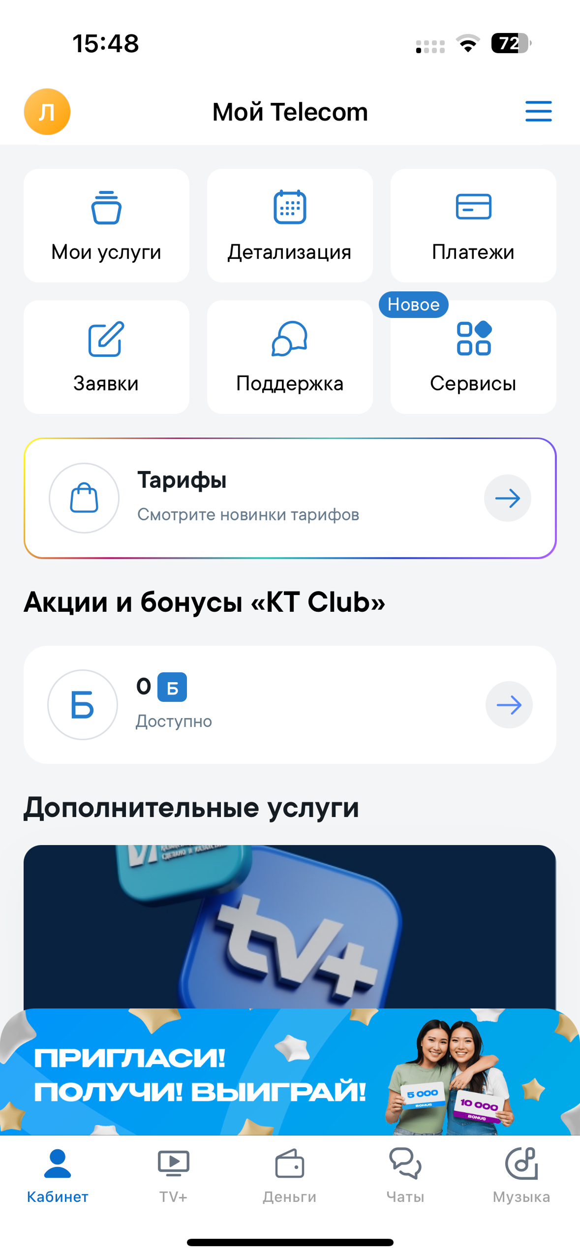
Original account · further down the page
The complete original Telecom screen after scrolling: account sections, plans, bonuses, additional services and an advertising banner.
Proposal · a dedicated Services section

The original path to an offer’s terms.

In the original app, an offer’s terms sit behind the bonuses section and an offer card. The “Refer a neighbour” card gives an end date of 31.08.2025, while the opened terms say 10.08.2025. The same offer has conflicting dates; rearranging the account screen does not resolve that.

Proposal

The concept groups the account, balance and top-up together, gives the plan its own area and places support and requests in the bottom navigation.